Kyocera KM-8030 KX Driver User Guide Version 5.90 - Page 56
Grayscale, Brightness, Contrast, Adjustment, Adjustment Settings, Shape, Ellipse, Round
 |
View all Kyocera KM-8030 manuals
Add to My Manuals
Save this manual to your list of manuals |
Page 56 highlights
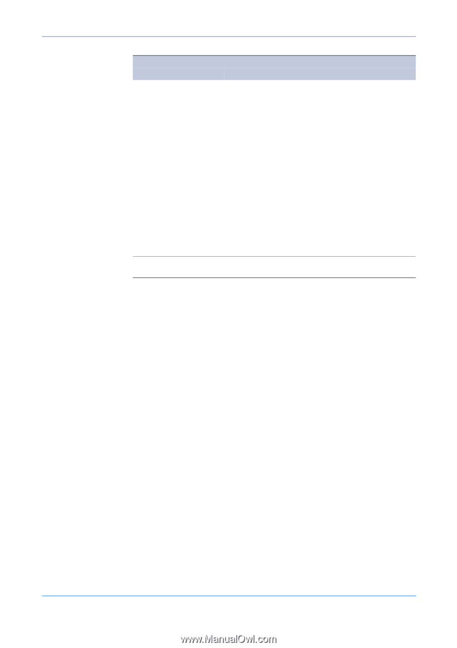
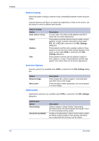
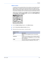
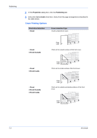
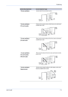
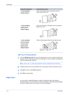
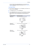
Imaging 6-7 Halftone Screen Option Shape Increase accuracy of screens Description Select the shape of the halftone dot. The choice for the best halftone shape depends on the pattern and number of colors for your image. Ellipse Resists optical jump, which is when areas of an image that should be smooth suddenly become darker. An ellipse shape provides a smoother gradation of tones. Choose for images with dark areas. Round Resists moiré formation and dot gain. Moiré formation is an unintended pattern that occurs when two or more colors are printed at the wrong angles. The correct angles depend on the number of colors being printed. Dot gain is when the halftone dots increase when printed, causing a moiré pattern. Choose for images with light tints and highlighted areas. Line Used for special effect. You can change the effect by selecting a different Angle. Uses a very precise halftone screen which provides better print quality, but may increase printing time. Grayscale Use the Grayscale options to adjust the appearance of graphics and text produced. Grayscale adjustment settings let you change the Brightness and Contrast of graphics. Grayscale adjustment settings are useful if graphic images are printing too light, too gray, or too dark. Text remains unaffected. 1 Click Adjustment to open the Adjustment Settings dialog box. 1 A preview image in the dialog box illustrates any brightness and contrast changes. 2 Drag the Brightness slider right to lighten, or left to darken the graphic images of the print job. 2 You can also change brightness by entering a numeric value in the text box at the right. The brightest setting is +100; the darkest is -100. Zero is the default mid-level setting. Adjusting brightness is useful when graphic images are printing too dark or too light. Text remains unaffected. 3 Drag the Contrast slider right or left to increase or decrease proportion of light to dark in the graphic images of the print job. 3 A high contrast setting decreases the grayscale spectrum, making light grays lighter and dark grays darker. A low contrast setting increases the grayscale spectrum, making light grays darker and dark grays lighter. You can also change contrast by entering a numeric value in the text box at the right. The highest contrast setting is +100; the lowest is -100. Zero is the default mid-level setting. Adjusting contrast is useful if graphic images are printing too gray, or too black and white. Text remains unaffected. KX Driver
-
 1
1 -
2
-
3
-
4
-
5
-
6
-
7
-
8
-
9
-
10
-
11
-
12
-
13
-
14
-
15
-
16
-
17
-
18
-
19
-
20
-
21
-
22
-
23
-
24
-
25
-
26
-
27
-
28
-
29
-
30
-
31
-
32
-
33
-
34
-
35
-
36
-
37
-
38
-
39
-
40
-
41
-
42
-
43
-
44
-
45
-
46
-
47
-
48
-
49
-
50
-
 51
51 -
 52
52 -
 53
53 -
 54
54 -
 55
55 -
 56
56 -
 57
57 -
 58
58 -
 59
59 -
 60
60 -
 61
61 -
62
-
63
-
64
-
65
-
66
-
67
-
68
-
69
-
70
-
71
-
72
-
73
-
74
-
75
-
76
-
77
-
78
-
79
-
80
-
81
-
82
-
83
-
84
-
85
-
86
-
87
-
88
-
89
-
90
-
91
-
92
-
93
-
94
-
95
-
96
-
97
-
98
-
99
-
100
-
101
-
102
-
103
-
104
-
105
 |
 |