Sharp XG-P10XU XGP10XU Operation Manual - Page 60
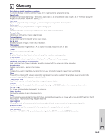
Sans-serif, Serif
 |
View all Sharp XG-P10XU manuals
Add to My Manuals
Save this manual to your list of manuals |
Page 60 highlights
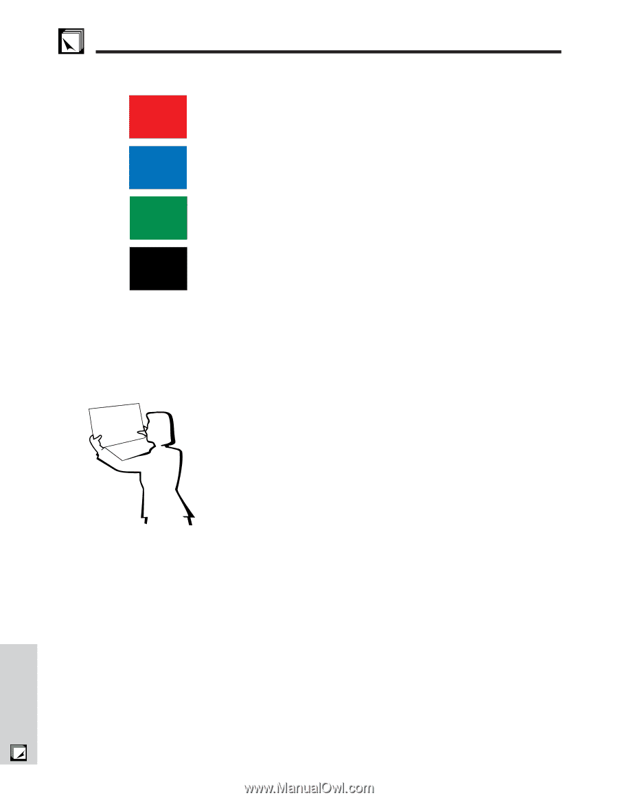
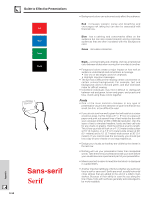
Appendix Guide to Effective Presentations Red Blue Green Black Presentation from SHARP Otpnhreaetsoaefrntehtatetoimoonossmvtisaculol,amtloimsootthnheimns,iesoltreachktaeiorsdnintoofarnteyyapdtey.pfoenotsf Sans-serif Serif E-59 • Background colors can subconsciously affect the audience: Red-increases viewers' pulse and breathing and encourages risk taking but can also be associated with financial loss. Blue-has a calming and conservative affect on the audience but can also create boredom among corporate audiences that are often inundated with this background color. Green-stimulates interaction. Black-conveys finality and certainty. Use it as a transitional color between slides when moving from one idea to another. • Foreground colors create a major impact on how well an audience understands and remembers a message. • Use one or two bright colors for emphasis. • Highlight important messages. • The eye has a difficult time reading certain colored text on certain colored backgrounds. For example, text and background colors in red and green, and blue and black make for difficult viewing. • Colorblind individuals may find it difficult to distinguish between red and green, brown and green, and purple and blue. Avoid using these colors together. Fonts • One of the most common mistakes in any type of presentation visual is the selection of type fonts that are too small, too thin, or too difficult to read. • If you are not sure how well a given font will read on a screen at various sizes, try this: Draw a 6 8Љ box on a piece of paper and print out several lines of text inside the box with your computer printer at 300 or 600 dpi resolution. Vary the sizes of text to simulate headline, body and text call-outs for any charts or graphs. Hold the printout at arm's length. This is how your text will look on a 4Ј (1.2 meter)-wide screen at 10Ј (3 meters), on a 7.5Ј (2.3 meter)-wide screen at 20Ј (6.1 meters) and a 12Ј (3.7 meter)-wide screen at 30Ј (9.1 meters). If you cannot read the text easily, you should put less copy on your visuals or use larger typefaces. • Design your visuals so that they are visible by the viewer in the last row. • Nothing will ruin your presentation faster than misspelled words. Take the time to proofread and edit your work before your visuals become a permanent part of your presentation. • Mixed case text is easier to read than text which is displayed in capital letters. • Another important attribute of fonts is whether any particular face is serif or sans-serif. Serifs are small, usually horizontal cross strokes that are added to the end of a letter's main strokes. Because of their ability to coax the eye along the line of type, fonts with serifs are generally acknowledged to be more readable.
-
 1
1 -
2
-
3
-
4
-
5
-
6
-
7
-
8
-
9
-
10
-
11
-
12
-
13
-
14
-
15
-
16
-
17
-
18
-
19
-
20
-
21
-
22
-
23
-
24
-
25
-
26
-
27
-
28
-
29
-
30
-
31
-
32
-
33
-
34
-
35
-
36
-
37
-
38
-
39
-
40
-
41
-
42
-
43
-
44
-
45
-
46
-
47
-
48
-
49
-
50
-
51
-
52
-
53
-
54
-
 55
55 -
 56
56 -
 57
57 -
 58
58 -
 59
59 -
 60
60 -
 61
61 -
 62
62 -
 63
63 -
 64
64 -
 65
65
 |
 |