Olympus E-PL2 E-PL2 Instruction Manual (English) - Page 43
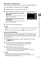
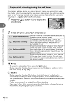
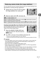
Basic photography/frequently-used options, Press, to display settings for the selected option.
 |
View all Olympus E-PL2 manuals
Add to My Manuals
Save this manual to your list of manuals |
Page 43 highlights
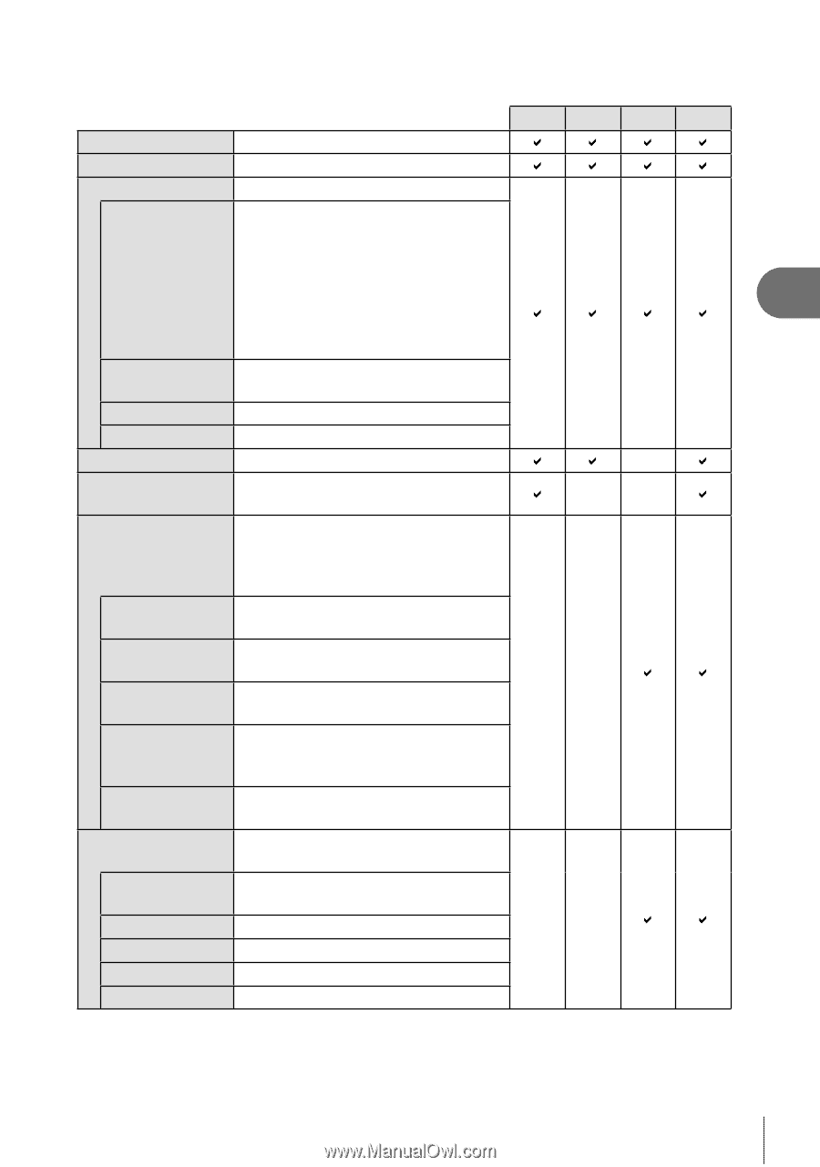
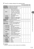
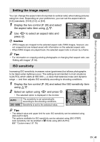
3 Press I to display settings for the selected option. h i-a J K CONTRAST Distinction between light and dark D D D D SHARPNESS Sharpness of the image DDDD GRADATION Adjust tone (gradation). AUTO Divides the image into detailed regions and adjusts the brightness separately for each region. This is effective for images with areas of large 1 contrast in which the whites DDDD appear too bright or the blacks appear too dark. Basic photography/frequently-used options NORMAL Use [NORMAL] mode for general uses. HIGH KEY Gradation for a bright subject. LOW KEY SATURATION Gradation for a dark subject. Vividness of the color D D k D EFFECT (i-ENHANCE) Sets the extent that the effect will be applied. D k k D B&W FILTER (MONOTONE) Creates a black and white image. The filter color is brightened and the complementary color is darkened. N:NEUTRAL Creates a normal black and white image. Ye:YELLOW Reproduces clearly defined white cloud with natural blue sky. k k D D Or:ORANGE Slightly emphasizes colors in blue skies and sunsets. R:RED Strongly emphasizes colors in blue skies and brightness of crimson foliage. G:GREEN Strongly emphasizes colors in red lips and green leaves. PICT. TONE (MONOTONE) Colors the black and white image. N:NEUTRAL S:SEPIA Creates a normal black and white image. Sepia k k D D B:BLUE Bluish P:PURPLE Purplish G:GREEN Greenish # Caution • Changes to contrast have no effect at settings other than [NORMAL]. EN 43
-
 1
1 -
2
-
3
-
4
-
5
-
6
-
7
-
8
-
9
-
10
-
11
-
12
-
13
-
14
-
15
-
16
-
17
-
18
-
19
-
20
-
21
-
22
-
23
-
24
-
25
-
26
-
27
-
28
-
29
-
30
-
31
-
32
-
33
-
34
-
35
-
36
-
37
-
 38
38 -
 39
39 -
 40
40 -
 41
41 -
 42
42 -
 43
43 -
 44
44 -
 45
45 -
 46
46 -
 47
47 -
 48
48 -
49
-
50
-
51
-
52
-
53
-
54
-
55
-
56
-
57
-
58
-
59
-
60
-
61
-
62
-
63
-
64
-
65
-
66
-
67
-
68
-
69
-
70
-
71
-
72
-
73
-
74
-
75
-
76
-
77
-
78
-
79
-
80
-
81
-
82
-
83
-
84
-
85
-
86
-
87
-
88
-
89
-
90
-
91
-
92
-
93
-
94
-
95
-
96
-
97
-
98
-
99
-
100
-
101
-
102
-
103
-
104
-
105
-
106
-
107
-
108
-
109
-
110
-
111
-
112
-
113
-
114
-
115
-
116
-
117
-
118
-
119
-
120
-
121
-
122
-
123
-
124
 |
 |