Epson SureColor P6000 Designer Edition User Manual - Page 118
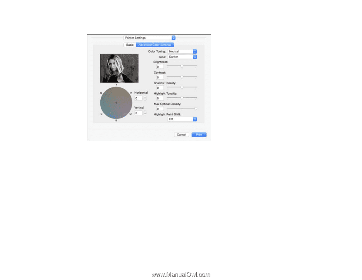
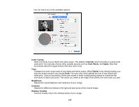
Color Toning, Neutral, Sepia, Darker, Brightness, Contrast, Shadow Tonality
 |
View all Epson SureColor P6000 Designer Edition manuals
Add to My Manuals
Save this manual to your list of manuals |
Page 118 highlights
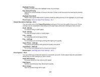
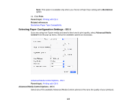
You can select any of the available options. Color Toning Adds tone (hue) to your black-and-white output. The default is Neutral, which provides a neutral tonal scale print. You can also choose other popular presets such as Cool, Warm, and Sepia. Note that the presets affect the target found in the tone color circle. Tone Changes the entire tonal scale of your black-and-white output. While Darker is the default setting, you may see better results if you choose Dark. The tone color circle adjusts the hue of your black-andwhite print. Click on any portion of the color wheel or enter corresponding values to customize the tone (hue) to add to your print. The closer you select to the edge of the wheel, the more color you add. Brightness Adjusts the overall lightness and darkness of your image. Contrast Adjusts the difference between the light and dark areas of the overall image. Shadow Tonality Controls tonality only in the shadow areas of your image. 118
-
 1
1 -
2
-
3
-
4
-
5
-
6
-
7
-
8
-
9
-
10
-
11
-
12
-
13
-
14
-
15
-
16
-
17
-
18
-
19
-
20
-
21
-
22
-
23
-
24
-
25
-
26
-
27
-
28
-
29
-
30
-
31
-
32
-
33
-
34
-
35
-
36
-
37
-
38
-
39
-
40
-
41
-
42
-
43
-
44
-
45
-
46
-
47
-
48
-
49
-
50
-
51
-
52
-
53
-
54
-
55
-
56
-
57
-
58
-
59
-
60
-
61
-
62
-
63
-
64
-
65
-
66
-
67
-
68
-
69
-
70
-
71
-
72
-
73
-
74
-
75
-
76
-
77
-
78
-
79
-
80
-
81
-
82
-
83
-
84
-
85
-
86
-
87
-
88
-
89
-
90
-
91
-
92
-
93
-
94
-
95
-
96
-
97
-
98
-
99
-
100
-
101
-
102
-
103
-
104
-
105
-
106
-
107
-
108
-
109
-
110
-
111
-
112
-
 113
113 -
 114
114 -
 115
115 -
 116
116 -
 117
117 -
 118
118 -
 119
119 -
 120
120 -
 121
121 -
 122
122 -
 123
123 -
124
-
125
-
126
-
127
-
128
-
129
-
130
-
131
-
132
-
133
-
134
-
135
-
136
-
137
-
138
-
139
-
140
-
141
-
142
-
143
-
144
-
145
-
146
-
147
-
148
-
149
-
150
-
151
-
152
-
153
-
154
-
155
-
156
-
157
-
158
-
159
-
160
-
161
-
162
-
163
-
164
-
165
-
166
-
167
-
168
-
169
-
170
-
171
-
172
-
173
-
174
-
175
-
176
-
177
-
178
-
179
-
180
-
181
-
182
-
183
-
184
-
185
-
186
-
187
-
188
-
189
-
190
-
191
-
192
-
193
-
194
-
195
-
196
-
197
-
198
-
199
-
200
-
201
-
202
-
203
-
204
-
205
-
206
-
207
-
208
-
209
-
210
-
211
-
212
-
213
-
214
-
215
-
216
-
217
-
218
-
219
-
220
-
221
-
222
-
223
-
224
-
225
-
226
 |
 |