HP Z3100ps HP Designjet Z3100 Printing Guide [PS Driver] - Proof a press with - Page 2
Coated SWOP v2` for US and Japan Standard v2 for Japan.
 |
UPC - 808736859547
View all HP Z3100ps manuals
Add to My Manuals
Save this manual to your list of manuals |
Page 2 highlights
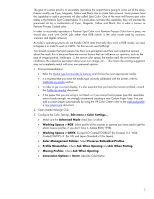
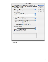
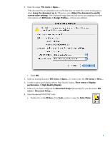
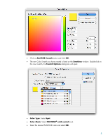
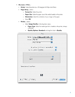
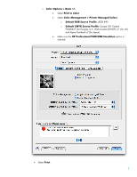
The goal of a press proof is to accurately reproduce the output that is going to come out of the press. Presses usually use Cyan, Magenta, Yellow and Black inks to create their artwork. Some presses have the capability to add a pre-mixed ink also called Spot Color. One of the most well known spot color tables is the Pantone Spot Coated tables. If a press does not have this capability, they will emulate the pre-mixed ink by a combination of Cyan, Magenta, Yellow and Black; this is what is known as Pantone Process Coated color. In order to accurately reproduce a Pantone Spot Color or a Pantone Process Color from a press, we should also work with CMYK jobs rather than RGB (which is the color mode used by monitors, scanners and digital cameras). As today's operating systems do not handle CMYK data (internally they work in RGB mode), we need to bypass it in order to work in CMYK. For this we can use PostScript. You should consider that each person has their own perception and their own subjective opinion about the result; this is because there are various factors that can influence our opinions, such as the type of image (portrait, landscape...), the source color space, the media used, the environmental conditions, the subjective perception about your own image, etc.... This means the printing suggestion may not completely match with your own personal opinion. 1. First recommendations: • Refer the Media type functionality & features and choose the most appropriate media. • It is essential that you have the media type correctly calibrated with the printer, refer to Calibrate my printer section. • In order to get a correct display, it's also essential that you have the monitor profiled, consult the Profile my monitor document. • If the paper that you are using is not listed, or if you cannot find a paper type that resembles yours closely enough, we strongly recommend creating a new Custom Paper Type. You can add a custom paper automatically by using the HP Color Center; refer to the Add and profile a new paper type document. 2. Open Adobe InDesign CS2. 3. Configure the Color Settings, Edit menu > Color Settings...: • Make sure the Advanced Mode check box is ticked. • Working Spaces > RGB: Select profile of the scanner or camera you have used to get the photo (source profile), if you don't have it, Adobe RGB (1998). • Working Spaces > CMYK: Europe ISO Coated FOGRA27 (for Europe), U.S. Web Coated (SWOP) v2` (for US) and Japan Standard v2 (for Japan). • Color Management Policies: Select Preserve Embedded Profiles. • Profile Mismatches: Check Ask When Opening and Ask When Pasting. • Missing Profiles: Check Ask When Opening. • Conversion Options > Intent: Absolute Colorimetric. 2
-
 1
1 -
 2
2 -
 3
3 -
 4
4 -
 5
5 -
 6
6 -
 7
7 -
 8
8 -
9
 |
 |
