Kyocera TASKalfa 3051ci Printing System (11),(12),(13),(14) Color Reference G - Page 71
Color and text, probat, regulam de rebus, non exceptis.
 |
View all Kyocera TASKalfa 3051ci manuals
Add to My Manuals
Save this manual to your list of manuals |
Page 71 highlights
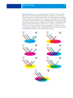
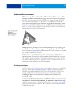
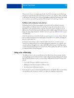
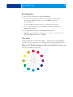
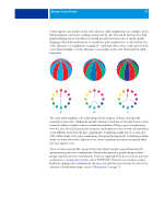
DESKTOP COLOR PRIMER 71 Color and text It is not a coincidence that the overwhelming majority of text you see is printed in black on white paper. Text in black on white is highly legible and is not fatiguing to read for extended periods. For many color materials, using black text on a white background and confining color to graphic elements and headings is a good choice. When used skillfully, color text can add flair to documents printed on paper. This technique is widely used in presentations. When using color text, avoid dazzling text and background combinations created from primary complements, especially red and cyan or red and blue. They are visually fatiguing and hard to read. Color text is more legible when distinguished from its background by a difference in lightness, for example, dark blue text on a light beige background. In addition, using many different colors in a string of text makes for a confused appearance and is hard to read. However, using a single highlight color is an effective way to draw the reader's eye to selected words. For color text samples, see the following figure. STOP! STOP! De gustibus non est disputandum. Exceptio probat regulam de rebus non exceptis. When using color text, keep in mind that small font sizes typically do not print in color with the same sharpness as in black. In most applications, black text prints exclusively in black toner, while color text usually prints with two or more toners. Any misregistration between the different toners on paper causes color text to lose definition. You can make test prints to find the smallest point size at which color text prints clearly. When using high-end graphics applications that allow you to specify color as percentages of cyan, magenta, yellow, black, you can create pure cyan or pure magenta text that prints with the same sharpness as black text. (Pure yellow text is extremely hard to read on anything but a dark or complementary background.)
-
 1
1 -
2
-
3
-
4
-
5
-
6
-
7
-
8
-
9
-
10
-
11
-
12
-
13
-
14
-
15
-
16
-
17
-
18
-
19
-
20
-
21
-
22
-
23
-
24
-
25
-
26
-
27
-
28
-
29
-
30
-
31
-
32
-
33
-
34
-
35
-
36
-
37
-
38
-
39
-
40
-
41
-
42
-
43
-
44
-
45
-
46
-
47
-
48
-
49
-
50
-
51
-
52
-
53
-
54
-
55
-
56
-
57
-
58
-
59
-
60
-
61
-
62
-
63
-
64
-
65
-
 66
66 -
 67
67 -
 68
68 -
 69
69 -
 70
70 -
 71
71 -
 72
72 -
 73
73 -
 74
74 -
 75
75 -
 76
76 -
77
-
78
-
79
-
80
-
81
-
82
-
83
-
84
-
85
-
86
-
87
-
88
-
89
-
90
-
91
 |
 |
