HP 40gs HP 39gs_40gs_Mastering The Graphing Calculator_English_E_F2224-90010.p - Page 117
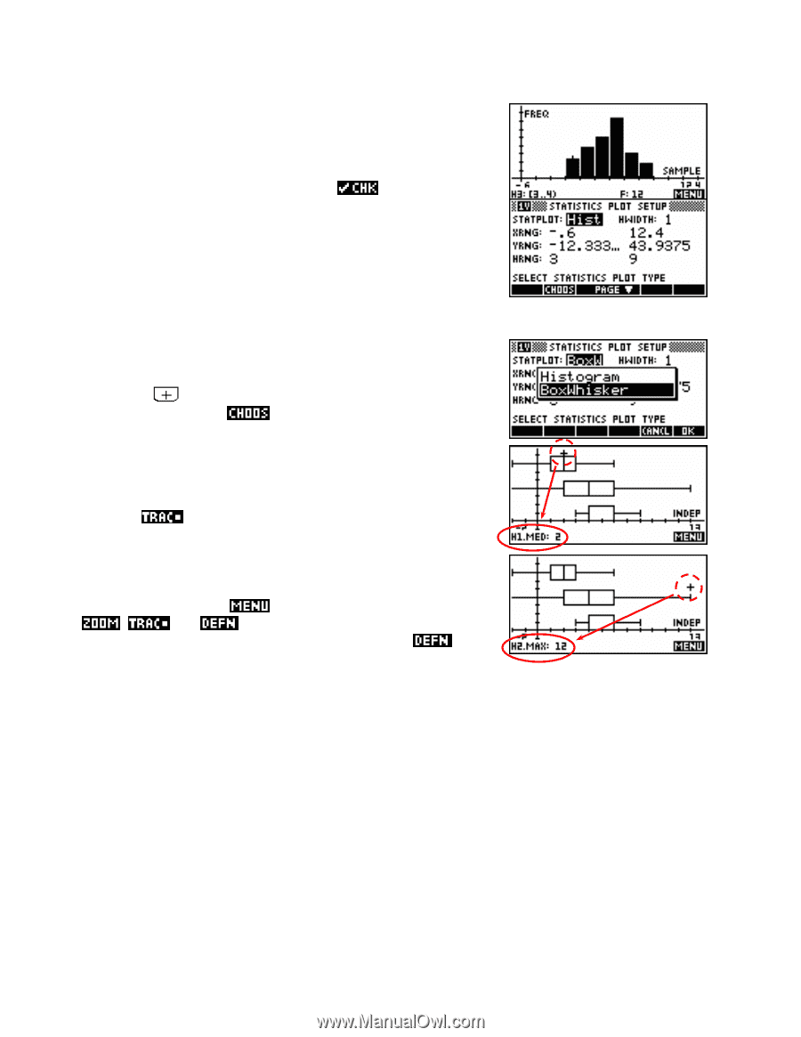
Plot Setup options, Box and whisker graphs, Box and Whisker.
 |
UPC - 882780045217
View all HP 40gs manuals
Add to My Manuals
Save this manual to your list of manuals |
Page 117 highlights
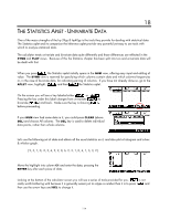
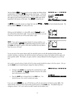
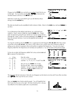
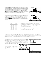
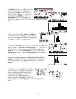
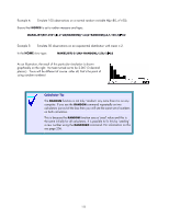
If you use the left/right arrows and look at the bottom of the screen you'll see that the frequencies and ranges are listed. It is probably worth tidying up this graph up a little by going into PLOT SETUP and (on the second page) setting the YTick value to be 5 instead of 1. In the graph to the right the Labels option has also been ed. You probably noticed a lot of other options in the first page of PLOT SETUP. Their explanations follow. Plot Setup options The setting of Statplot controls what type of graph is drawn. There two choices are Hist (short for histogram) or BoxW (Box and Whisker). Pressing the key while Statplot is highlighted will switch between these two, or you use the button to pick from a menu. Box and whisker graphs Unlike histograms, it is possible to have more than one box and whisker graph plotted. This makes comparisons between data sets very easy. If you look for the cursor (circled) in the diagram shown right, you will see that when is turned on then information about the graph is given at the bottom of the screen. As usual the up/down arrows change from graph to graph, while the left/right arrows move within the graph. As an aside, pressing the key produces the normal tools of , and . They all behave in the normal manner as was discussed in detail in the Function aplet chapter. The tool can be quite useful by displaying information on which columns make up each graph if you lose track. Looking again at the screen shot of the first page of PLOT SETUP (near the top of the page) you will see that there are three ranges. As with the Parametric and Polar aplets, XRng and YRng control how much of the graph is seen. If your histogram has frequencies of (say) up to 30 then you need to make sure your YRng reaches at least that value or the top of the histogram will be cut off. In the same way, if your data has a minimum value of -5 and a maximum of 35 then your XRng will need to cover at least that range of values. This is normally not worth worrying about since using VIEWS Auto Scale generally produces very satisfactory results. 117
-
 1
1 -
2
-
3
-
4
-
5
-
6
-
7
-
8
-
9
-
10
-
11
-
12
-
13
-
14
-
15
-
16
-
17
-
18
-
19
-
20
-
21
-
22
-
23
-
24
-
25
-
26
-
27
-
28
-
29
-
30
-
31
-
32
-
33
-
34
-
35
-
36
-
37
-
38
-
39
-
40
-
41
-
42
-
43
-
44
-
45
-
46
-
47
-
48
-
49
-
50
-
51
-
52
-
53
-
54
-
55
-
56
-
57
-
58
-
59
-
60
-
61
-
62
-
63
-
64
-
65
-
66
-
67
-
68
-
69
-
70
-
71
-
72
-
73
-
74
-
75
-
76
-
77
-
78
-
79
-
80
-
81
-
82
-
83
-
84
-
85
-
86
-
87
-
88
-
89
-
90
-
91
-
92
-
93
-
94
-
95
-
96
-
97
-
98
-
99
-
100
-
101
-
102
-
103
-
104
-
105
-
106
-
107
-
108
-
109
-
110
-
111
-
 112
112 -
 113
113 -
 114
114 -
 115
115 -
 116
116 -
 117
117 -
 118
118 -
 119
119 -
 120
120 -
 121
121 -
 122
122 -
123
-
124
-
125
-
126
-
127
-
128
-
129
-
130
-
131
-
132
-
133
-
134
-
135
-
136
-
137
-
138
-
139
-
140
-
141
-
142
-
143
-
144
-
145
-
146
-
147
-
148
-
149
-
150
-
151
-
152
-
153
-
154
-
155
-
156
-
157
-
158
-
159
-
160
-
161
-
162
-
163
-
164
-
165
-
166
-
167
-
168
-
169
-
170
-
171
-
172
-
173
-
174
-
175
-
176
-
177
-
178
-
179
-
180
-
181
-
182
-
183
-
184
-
185
-
186
-
187
-
188
-
189
-
190
-
191
-
192
-
193
-
194
-
195
-
196
-
197
-
198
-
199
-
200
-
201
-
202
-
203
-
204
-
205
-
206
-
207
-
208
-
209
-
210
-
211
-
212
-
213
-
214
-
215
-
216
-
217
-
218
-
219
-
220
-
221
-
222
-
223
-
224
-
225
-
226
-
227
-
228
-
229
-
230
-
231
-
232
-
233
-
234
-
235
-
236
-
237
-
238
-
239
-
240
-
241
-
242
-
243
-
244
-
245
-
246
-
247
-
248
-
249
-
250
-
251
-
252
-
253
-
254
-
255
-
256
-
257
-
258
-
259
-
260
-
261
-
262
-
263
-
264
-
265
-
266
-
267
-
268
-
269
-
270
-
271
-
272
-
273
-
274
-
275
-
276
-
277
-
278
-
279
-
280
-
281
-
282
-
283
-
284
-
285
-
286
-
287
-
288
-
289
-
290
-
291
-
292
-
293
-
294
-
295
-
296
-
297
-
298
-
299
-
300
-
301
-
302
-
303
-
304
-
305
-
306
-
307
-
308
-
309
-
310
-
311
-
312
-
313
-
314
-
315
-
316
-
317
-
318
-
319
-
320
-
321
-
322
-
323
-
324
-
325
-
326
-
327
-
328
-
329
-
330
-
331
-
332
-
333
-
334
-
335
-
336
-
337
-
338
-
339
-
340
-
341
-
342
-
343
-
344
-
345
-
346
-
347
-
348
-
349
-
350
-
351
-
352
-
353
-
354
-
355
-
356
-
357
-
358
-
359
-
360
-
361
-
362
-
363
-
364
-
365
-
366
 |
 |