Kyocera KM-C2030 FieryX3e+ Color Reference Guide - Page 95
CIE color model, color space, metamerism
 |
View all Kyocera KM-C2030 manuals
Add to My Manuals
Save this manual to your list of manuals |
Page 95 highlights
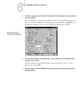
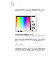
AA-3 Desktop Color Primer CIE color model In the 1930s, the Commission Internationale de l'Eclairage (CIE) defined a standard color space, a way of defining colors in mathematical terms, to help in the communication of color information. This color space is based on research on the nature of color perception. The following CIE chromaticity diagram is a two-dimensional model of color vision. The arc around the top of the horseshoe encompasses the pure, or spectral, colors from blue-violet to red. Although the CIE chromaticity diagram is not perceptually uniform-some areas of the diagram seem to compress color differences relative to others-it is a good tool for illustrating some interesting aspects of color vision. By mixing any two spectral colors in different proportions, we can create all the colors found on the straight line drawn between them in the diagram. It is possible to create the same gray by mixing blue-green and red light or by mixing yellow-green and blueviolet light. This is possible because of a phenomenon peculiar to color vision called metamerism. The eye does not distinguish individual wavelengths of light. Therefore, different combinations of spectral light can produce the same perceived color.
-
 1
1 -
2
-
3
-
4
-
5
-
6
-
7
-
8
-
9
-
10
-
11
-
12
-
13
-
14
-
15
-
16
-
17
-
18
-
19
-
20
-
21
-
22
-
23
-
24
-
25
-
26
-
27
-
28
-
29
-
30
-
31
-
32
-
33
-
34
-
35
-
36
-
37
-
38
-
39
-
40
-
41
-
42
-
43
-
44
-
45
-
46
-
47
-
48
-
49
-
50
-
51
-
52
-
53
-
54
-
55
-
56
-
57
-
58
-
59
-
60
-
61
-
62
-
63
-
64
-
65
-
66
-
67
-
68
-
69
-
70
-
71
-
72
-
73
-
74
-
75
-
76
-
77
-
78
-
79
-
80
-
81
-
82
-
83
-
84
-
85
-
86
-
87
-
88
-
89
-
 90
90 -
 91
91 -
 92
92 -
 93
93 -
 94
94 -
 95
95 -
 96
96 -
 97
97 -
 98
98 -
 99
99 -
 100
100 -
101
-
102
-
103
-
104
-
105
-
106
-
107
-
108
-
109
-
110
-
111
-
112
-
113
-
114
-
115
-
116
-
117
-
118
-
119
-
120
-
121
-
122
-
123
-
124
 |
 |
