Kyocera TASKalfa 4551ci Printing System (11),(12),(13),(14) Color Reference G - Page 69
General guidelines, Color wheel
 |
View all Kyocera TASKalfa 4551ci manuals
Add to My Manuals
Save this manual to your list of manuals |
Page 69 highlights
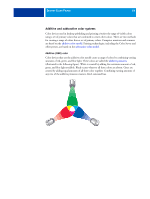
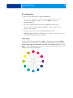
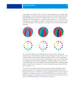
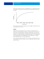
DESKTOP COLOR PRIMER 69 General guidelines To create successful color materials, consider the following: • Use color to aid comprehension, rather than applying colors indiscriminately. In presentations, graphs, and charts, use color to highlight patterns and emphasize differences. • Use color sparingly. In general, fewer colors work better than many colors. • Use red as an accent color. Red is particularly effective when used in otherwise monochromatic materials. • Consider the tastes of your target audience when choosing colors. • Keep a file of printed color pieces that appeal to you or strike you as effective. Refer to it for ideas when designing your own documents. Color wheel A color wheel like the one in the following figure is a helpful tool for understanding the interrelation of colors. The colors on one side of the color wheel, from magenta to yellow, appear to most people to be warm colors, while those on the other side, from green to blue, appear to be cool. The distance between two colors on the color wheel can help predict how they will appear when seen side by side.
-
 1
1 -
2
-
3
-
4
-
5
-
6
-
7
-
8
-
9
-
10
-
11
-
12
-
13
-
14
-
15
-
16
-
17
-
18
-
19
-
20
-
21
-
22
-
23
-
24
-
25
-
26
-
27
-
28
-
29
-
30
-
31
-
32
-
33
-
34
-
35
-
36
-
37
-
38
-
39
-
40
-
41
-
42
-
43
-
44
-
45
-
46
-
47
-
48
-
49
-
50
-
51
-
52
-
53
-
54
-
55
-
56
-
57
-
58
-
59
-
60
-
61
-
62
-
63
-
 64
64 -
 65
65 -
 66
66 -
 67
67 -
 68
68 -
 69
69 -
 70
70 -
 71
71 -
 72
72 -
 73
73 -
 74
74 -
75
-
76
-
77
-
78
-
79
-
80
-
81
-
82
-
83
-
84
-
85
-
86
-
87
-
88
-
89
-
90
-
91
 |
 |