Kyocera TASKalfa 4551ci Printing System (11),(12),(13),(14) Color Reference G - Page 70
custom color system
 |
View all Kyocera TASKalfa 4551ci manuals
Add to My Manuals
Save this manual to your list of manuals |
Page 70 highlights
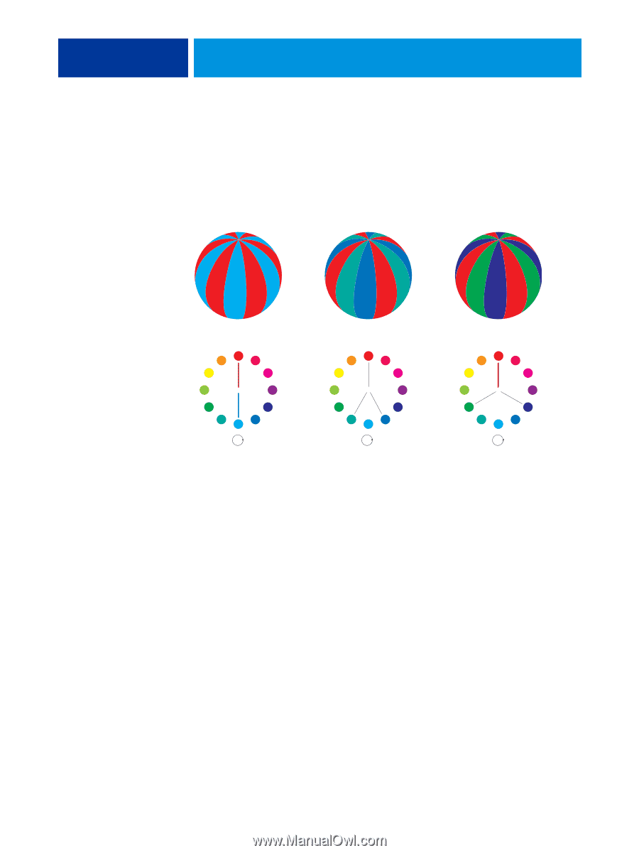
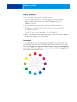
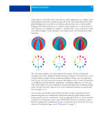
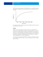
DESKTOP COLOR PRIMER 70 Colors opposite one another on the color wheel are called complements (see example a in the following figure), and create a striking contrast side by side. This can be the basis for a bold graphical design, but it is an effect you should use with discretion, since it can be visually fatiguing. Other bold combinations to consider are split complements-a color and the two colors adjacent to its complement (example b)-and triads (three colors evenly spaced on the color wheel (example c). Colors adjacent to one another on the color wheel result in subtle harmonies. a b c The color wheel simplifies color relationships for the purpose of clarity, showing only saturated or pure colors. Adding the myriad variations of each hue to the palette (more or less saturated, darker, or lighter) creates a wealth of possibilities. Taking a pair of complements from the color wheel and varying the saturation and brightness of one or both colors produces a very different result from the pure complements. Combining a light tint of a warm color with a darker shade of its cooler complement often gives pleasing results. Combining a darker shade of a warm color with a light tint of its cooler complement produces an unusual effect that may appeal to you. Once you have mastered the concept of the color wheel, you have a good framework for experimenting with color combinations. Many books targeted at graphic designers show groups of preselected color combinations. Some are organized by themes or moods, and some are based on a custom color system, such as PANTONE. The more you develop a critical facility for judging color combinations, the more you will trust your own eye for color. For a selection of books about design, see the "Bibliography" on page 75.
-
 1
1 -
2
-
3
-
4
-
5
-
6
-
7
-
8
-
9
-
10
-
11
-
12
-
13
-
14
-
15
-
16
-
17
-
18
-
19
-
20
-
21
-
22
-
23
-
24
-
25
-
26
-
27
-
28
-
29
-
30
-
31
-
32
-
33
-
34
-
35
-
36
-
37
-
38
-
39
-
40
-
41
-
42
-
43
-
44
-
45
-
46
-
47
-
48
-
49
-
50
-
51
-
52
-
53
-
54
-
55
-
56
-
57
-
58
-
59
-
60
-
61
-
62
-
63
-
64
-
 65
65 -
 66
66 -
 67
67 -
 68
68 -
 69
69 -
 70
70 -
 71
71 -
 72
72 -
 73
73 -
 74
74 -
 75
75 -
76
-
77
-
78
-
79
-
80
-
81
-
82
-
83
-
84
-
85
-
86
-
87
-
88
-
89
-
90
-
91
 |
 |