Oki C5300n OKI C5300 User's Guide: Mac (Am English) - Page 77
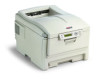
Absolute Colorimetric, Perceptual, Relative Colorimetric, Saturation
 |
View all Oki C5300n manuals
Add to My Manuals
Save this manual to your list of manuals |
Page 77 highlights
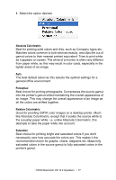
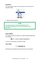
1. Select the option desired. Absolute Colorimetric Best for printing solid colors and tints, such as Company logos etc. Matches colors common to both devices exactly, and clips the out of gamut colors to their nearest printed equivalent. Tries to print white as it appears on screen. The white of a monitor is often very different from paper white, so this may result in color casts, especially in the lighter areas of an image. Auto The best default select as this selects the optimal settings for a general office environment. Perceptual Best choice for printing photographs. Compresses the source gamut into the printer's gamut whilst maintaining the overall appearance of an image. This may change the overall appearance of an image as all the colors are shifted together. Relative Colorimetric Good for proofing CMYK color images on a desktop printer. Much like Absolute Colorimetric, except that it scales the source white to the (usually) paper white; i.e. unlike Absolute Colorimetric, this attempts to take the paper white into account. Saturation Best choice for printing bright and saturated colors if you don't necessarily care how accurate the colors are. This makes it the recommended choice for graphs, charts, diagrams etc. Maps fully saturated colors in the source gamut to fully saturated colors in the printer's gamut. C5300 Macintosh OS 10.2 Operation • 77
-
 1
1 -
2
-
3
-
4
-
5
-
6
-
7
-
8
-
9
-
10
-
11
-
12
-
13
-
14
-
15
-
16
-
17
-
18
-
19
-
20
-
21
-
22
-
23
-
24
-
25
-
26
-
27
-
28
-
29
-
30
-
31
-
32
-
33
-
34
-
35
-
36
-
37
-
38
-
39
-
40
-
41
-
42
-
43
-
44
-
45
-
46
-
47
-
48
-
49
-
50
-
51
-
52
-
53
-
54
-
55
-
56
-
57
-
58
-
59
-
60
-
61
-
62
-
63
-
64
-
65
-
66
-
67
-
68
-
69
-
70
-
71
-
 72
72 -
 73
73 -
 74
74 -
 75
75 -
 76
76 -
 77
77 -
 78
78 -
 79
79 -
 80
80 -
 81
81 -
 82
82 -
83
-
84
-
85
-
86
-
87
-
88
-
89
-
90
-
91
-
92
-
93
-
94
-
95
-
96
-
97
-
98
-
99
-
100
-
101
-
102
-
103
-
104
-
105
-
106
-
107
-
108
-
109
-
110
-
111
-
112
-
113
-
114
-
115
-
116
-
117
-
118
-
119
-
120
-
121
-
122
-
123
-
124
-
125
-
126
-
127
-
128
-
129
-
130
-
131
-
132
-
133
-
134
-
135
-
136
-
137
-
138
-
139
-
140
-
141
-
142
-
143
-
144
-
145
-
146
-
147
-
148
-
149
-
150
-
151
-
152
-
153
-
154
-
155
-
156
-
157
-
158
-
159
-
160
-
161
-
162
-
163
-
164
-
165
-
166
-
167
-
168
-
169
-
170
-
171
-
172
-
173
-
174
-
175
-
176
-
177
-
178
-
179
-
180
-
181
-
182
-
183
-
184
-
185
-
186
-
187
-
188
-
189
-
190
-
191
-
192
-
193
-
194
-
195
-
196
-
197
-
198
-
199
-
200
-
201
-
202
-
203
-
204
-
205
-
206
-
207
-
208
-
209
-
210
-
211
 |
 |