Brother International GT-361 Instruction Manual - English - Page 67
Settings for White Ink, 4-3-12. Selecting the Color Processing for increasing the Vividness
 |
View all Brother International GT-361 manuals
Add to My Manuals
Save this manual to your list of manuals |
Page 67 highlights
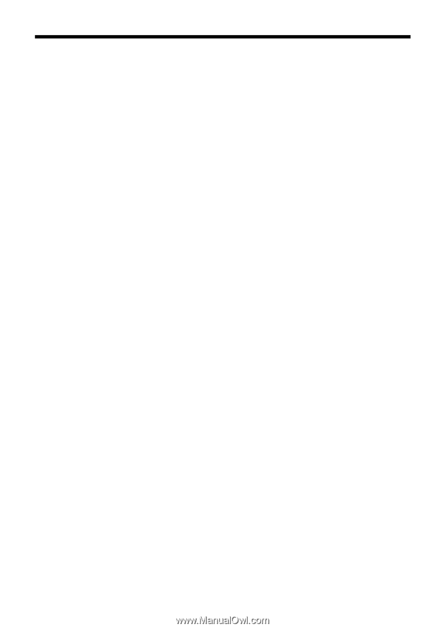
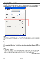
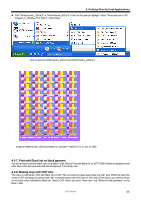
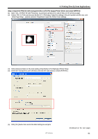
4. Printing Directly from Applications 4-3-11. Settings for White Ink This menu is available only for White ink ([ Color + White ] and [ White Only ]). RGB=255 white (paper color) is always transparent with no ink printed. RGB=0 black is transparent too when [ Print with Black ink ] is checked OFF, when black color is expressed with the background T-shirt body color. Transparent Color You can select one transparent RGB color so that you can use red T-shirt color in the print data by changing R=255 GB=0 red as transparent, instead of printing red colors with Magenta and Yellow ink combination. (1) Check [ Transparent Color ] checkbox then the pull-down menu in the right will be available. (2) Select one color from the pull-down menu (T-shirt simulation colors) or click [ Custom Color ] button and input RGB values. Only one Custom Color is available at a time. This RGB values will not be added to the list. Tolerance Select the range from the transparent color to the normally-masked color. The gradation range becomes wider when the value is bigger. Smooth gradation depends on the original image data. Better to do test print in advance. Choke Width Sometimes the mask White ink can be shown, which depends on the thickness of the T-shirt, humidity of the room, etc. You can choke (cut out) the outline by one dot (1/600 dpi). Select the value. (The "double" dots are cut out when the resolution is 1200 dpi x 1200 dpi.) If the value is bigger, some thin lines (in the letters, photos, etc) might disappear. Better to do test print in advance. 4-3-12. Selecting the Color Processing for increasing the Vividness When the image data is well-contrasted, adjust mainly with Saturation. When the image data is plain and dull, adjust mainly with Contrast. [ 0 ] around [10 ] around [20 ] around [30 ] [40 ] no additional processing no change in tone, a little brighter, good for photos more vivid, for dull photo or RGB images for light CMYK images maximum adjustment, for dull and plain CMYK images The bigger value, more adjustment. When the image data is in CMYK mode, change the RGB mode and print with both Saturation and Contrast around [ 30 ]. Sometimes the fine design may be flat with bigger [ Contrast ]. Better to do test print in advance because sometimes the print data is unexpectedly changed. This menu is the same as GT-782, advanced Vivid Processing of GT-541. You can arrange the saturation (the strength of the colors) and the contrast separately. GT-541 Vivid Processing is equal to GT-3 Contrast and you can adjust more precisely by 0-40. Vivid Processing 1 is identical to Contrast 10. GT-3 Series 57
-
 1
1 -
2
-
3
-
4
-
5
-
6
-
7
-
8
-
9
-
10
-
11
-
12
-
13
-
14
-
15
-
16
-
17
-
18
-
19
-
20
-
21
-
22
-
23
-
24
-
25
-
26
-
27
-
28
-
29
-
30
-
31
-
32
-
33
-
34
-
35
-
36
-
37
-
38
-
39
-
40
-
41
-
42
-
43
-
44
-
45
-
46
-
47
-
48
-
49
-
50
-
51
-
52
-
53
-
54
-
55
-
56
-
57
-
58
-
59
-
60
-
61
-
 62
62 -
 63
63 -
 64
64 -
 65
65 -
 66
66 -
 67
67 -
 68
68 -
 69
69 -
 70
70 -
 71
71 -
 72
72 -
73
-
74
-
75
-
76
-
77
-
78
-
79
-
80
-
81
-
82
-
83
-
84
-
85
-
86
-
87
-
88
-
89
-
90
-
91
-
92
-
93
-
94
-
95
-
96
-
97
-
98
-
99
-
100
-
101
-
102
-
103
-
104
-
105
-
106
-
107
-
108
-
109
-
110
-
111
-
112
-
113
-
114
-
115
-
116
-
117
-
118
-
119
-
120
-
121
-
122
-
123
-
124
-
125
-
126
-
127
-
128
-
129
-
130
-
131
-
132
-
133
-
134
-
135
-
136
-
137
-
138
-
139
-
140
-
141
-
142
-
143
-
144
-
145
-
146
-
147
-
148
 |
 |