Brother International MFC 3100C Users Manual - English - Page 169
Scanner Profile, Perceptual Matching, Saturation Matching, Relative Colorimetric Matching
 |
UPC - 012502565819
View all Brother International MFC 3100C manuals
Add to My Manuals
Save this manual to your list of manuals |
Page 169 highlights
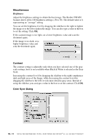
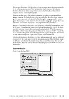
Perceptual Matching-All the colors of a given gamut are scaled proportionally to fit within another gamut. This intent pretty much maintain the balance between the colors in the image. This intent is the best choice for realistic images, such as scanned photographs. Saturation Matching-The relative saturation of colors is maintained from gamut to gamut. So basically the colors are shifted to the edge of the gamut to get the most saturated color possible. Rendering the image using this intent gives the strongest colors and is the best choice for bar graphs and pie charts, in which the actual color displayed is less important than its vividness. Relative Colorimetric Matching-The colors that fall within the gamuts of both devices are left unchanged. Some colors in both images will be exactly the same, a useful outcome when colors must match quantitatively. What that means is that if the color is inside the gamut, it will stay the same color. However, if the color is outside the gamut, it will be mapped to the edge of the gamut. This intent is best suited for logos or "spot colors" where color must match. Absolute Colorimetric Matching-A close appearance match may be achieved over most of the tonal range, but if the minimum density of the idealized image is different from that of the output image, the areas of the image that are left blank will be different. Colors that fall within the gamuts of both devices are left unchanged. Scanner Profile Select your Brother MFC. U S I N G T H E B R O T H E R M F C W I T H A N E W P O W E R M A C I N T O S H ® G 3 , G 4 O R I M A C ™ / I B O O K ™ 18 - 12
-
 1
1 -
2
-
3
-
4
-
5
-
6
-
7
-
8
-
9
-
10
-
11
-
12
-
13
-
14
-
15
-
16
-
17
-
18
-
19
-
20
-
21
-
22
-
23
-
24
-
25
-
26
-
27
-
28
-
29
-
30
-
31
-
32
-
33
-
34
-
35
-
36
-
37
-
38
-
39
-
40
-
41
-
42
-
43
-
44
-
45
-
46
-
47
-
48
-
49
-
50
-
51
-
52
-
53
-
54
-
55
-
56
-
57
-
58
-
59
-
60
-
61
-
62
-
63
-
64
-
65
-
66
-
67
-
68
-
69
-
70
-
71
-
72
-
73
-
74
-
75
-
76
-
77
-
78
-
79
-
80
-
81
-
82
-
83
-
84
-
85
-
86
-
87
-
88
-
89
-
90
-
91
-
92
-
93
-
94
-
95
-
96
-
97
-
98
-
99
-
100
-
101
-
102
-
103
-
104
-
105
-
106
-
107
-
108
-
109
-
110
-
111
-
112
-
113
-
114
-
115
-
116
-
117
-
118
-
119
-
120
-
121
-
122
-
123
-
124
-
125
-
126
-
127
-
128
-
129
-
130
-
131
-
132
-
133
-
134
-
135
-
136
-
137
-
138
-
139
-
140
-
141
-
142
-
143
-
144
-
145
-
146
-
147
-
148
-
149
-
150
-
151
-
152
-
153
-
154
-
155
-
156
-
157
-
158
-
159
-
160
-
161
-
162
-
163
-
 164
164 -
 165
165 -
 166
166 -
 167
167 -
 168
168 -
 169
169 -
 170
170 -
 171
171 -
 172
172 -
 173
173 -
 174
174 -
175
-
176
-
177
-
178
-
179
-
180
-
181
-
182
-
183
-
184
-
185
-
186
-
187
-
188
-
189
-
190
-
191
-
192
-
193
-
194
-
195
-
196
-
197
-
198
-
199
-
200
-
201
-
202
-
203
-
204
-
205
-
206
-
207
-
208
-
209
-
210
 |
 |