Konica Minolta bizhub PRESS C6000 IC-307 User Guide - Page 74
Creating and editing a gradation table, DefaultGradTable, Gradation Table, Lively, Saturated, Sharp
 |
View all Konica Minolta bizhub PRESS C6000 manuals
Add to My Manuals
Save this manual to your list of manuals |
Page 74 highlights
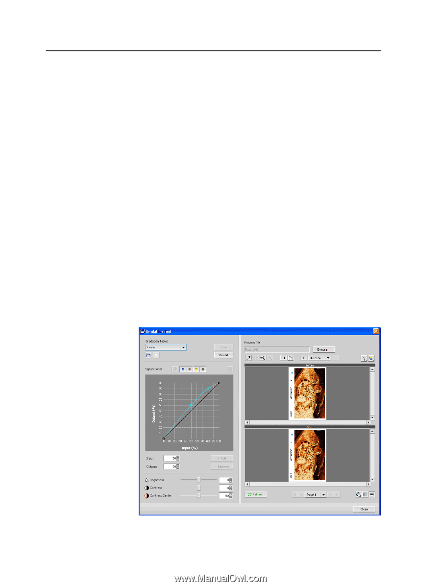
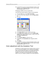
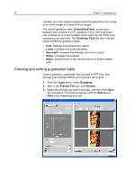
66 Chapter 7-Managing color contrast, and color balance adjustments throughout the tone range of an entire image or in specific tone ranges. The default gradation table, DefaultGradTable, serves as a baseline and consists of a 45° gradation curve, with brightness and contrast set to 0 and contrast center set to 50. All of the color separations are selected. The Gradation Table list also includes these predefined gradation tables: ● Cool: Displays blue tones more clearly ● Lively: Increases the color saturation ● Saturated: Increases the strength (chroma or purity) ● Sharp: Increases the contrast ● Warm: Sets the hues in the low densities to a bright reddish color Creating and editing a gradation table Correct gradation, brightness, and contrast in RTP files, and preview your changes before you send your job to print. 1. From the Tools menu, select Gradation. 2. Next to the Preview File box, click Browse. 3. Select the job that you want to preview, and then click Open. The Gradation Tool window appears with the Before and After views displaying your job.
-
 1
1 -
2
-
3
-
4
-
5
-
6
-
7
-
8
-
9
-
10
-
11
-
12
-
13
-
14
-
15
-
16
-
17
-
18
-
19
-
20
-
21
-
22
-
23
-
24
-
25
-
26
-
27
-
28
-
29
-
30
-
31
-
32
-
33
-
34
-
35
-
36
-
37
-
38
-
39
-
40
-
41
-
42
-
43
-
44
-
45
-
46
-
47
-
48
-
49
-
50
-
51
-
52
-
53
-
54
-
55
-
56
-
57
-
58
-
59
-
60
-
61
-
62
-
63
-
64
-
65
-
66
-
67
-
68
-
 69
69 -
 70
70 -
 71
71 -
 72
72 -
 73
73 -
 74
74 -
 75
75 -
 76
76 -
 77
77 -
 78
78 -
 79
79 -
80
-
81
-
82
-
83
-
84
-
85
-
86
-
87
-
88
-
89
-
90
-
91
-
92
-
93
-
94
-
95
-
96
-
97
-
98
-
99
-
100
-
101
-
102
-
103
-
104
-
105
-
106
-
107
-
108
-
109
-
110
-
111
-
112
-
113
-
114
-
115
-
116
-
117
-
118
-
119
-
120
-
121
-
122
-
123
-
124
-
125
-
126
-
127
-
128
-
129
-
130
-
131
-
132
-
133
-
134
-
135
-
136
-
137
-
138
-
139
-
140
-
141
-
142
-
143
-
144
-
145
-
146
-
147
-
148
-
149
-
150
-
151
-
152
-
153
-
154
-
155
-
156
-
157
-
158
-
159
-
160
-
161
-
162
-
163
-
164
-
165
-
166
-
167
-
168
-
169
-
170
-
171
-
172
-
173
-
174
-
175
-
176
-
177
-
178
-
179
-
180
-
181
-
182
-
183
-
184
-
185
-
186
-
187
-
188
-
189
-
190
-
191
-
192
-
193
-
194
-
195
-
196
 |
 |