Brother International MacBroidery„ Embroidery Lettering Software for Mac - Page 45
Kerning Text Segments
 |
View all Brother International MacBroidery„ Embroidery Lettering Software for Mac manuals
Add to My Manuals
Save this manual to your list of manuals |
Page 45 highlights
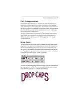
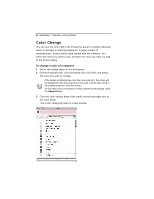
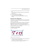
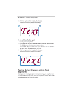
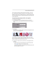
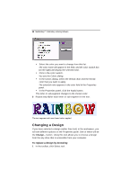
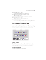
Creating and Editing New Designs 43 4 In the dialog, select the desired thread chart from the Thread chart field. The colors displayed will change according to the thread chart you have selected. 5 Click on the desired color to select it. 6 In the Properties tab, click the Apply button. The color of the selected segment will change to match your selection. Kerning Text Segments Kerning refers to the space between adjacent letters. You can adjust the kerning of a text segment to make it more visually appealing, or to make it fit in a tighter space. You can adjust the kerning by entering any number of kerning marks in between the letters in the Text box on the Properties panel. Add a "greater than" > symbol to increase kerning, and a "less than" < symbol to decrease it. One > or < mark represents 1/20th of the width of a letter "M" of the font you are working in. To move letters closer together: 1 Select a text segment. Original text segment, with the kerning as is. 2 In the Text box (on the Properties panel), enter the "less than" sign (
-
 1
1 -
2
-
3
-
4
-
5
-
6
-
7
-
8
-
9
-
10
-
11
-
12
-
13
-
14
-
15
-
16
-
17
-
18
-
19
-
20
-
21
-
22
-
23
-
24
-
25
-
26
-
27
-
28
-
29
-
30
-
31
-
32
-
33
-
34
-
35
-
36
-
37
-
38
-
39
-
 40
40 -
 41
41 -
 42
42 -
 43
43 -
 44
44 -
 45
45 -
 46
46 -
 47
47 -
 48
48 -
 49
49 -
 50
50 -
51
-
52
-
53
-
54
-
55
 |
 |
