Epson LQ-1000 User Manual - Page 90
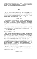
Quality or proportional characters. For Letter Quality you do not use, can be used for either Letter
 |
View all Epson LQ-1000 manuals
Add to My Manuals
Save this manual to your list of manuals |
Page 90 highlights
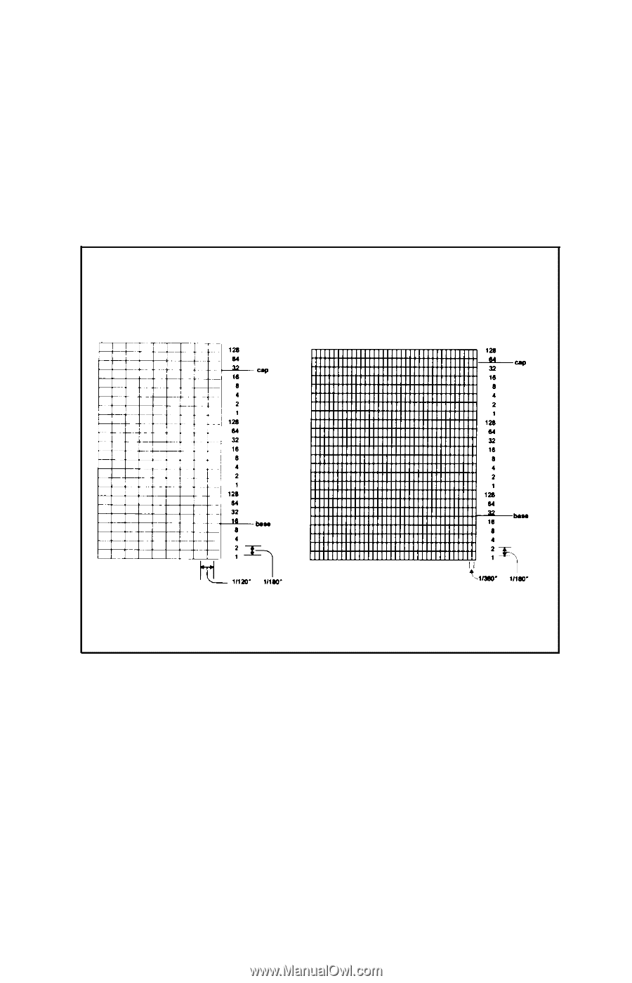
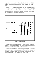
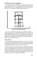
proportional characters it is 37 dots wide, with the dots for both Letter Quality and proportional spaced more closely together than those for draft . Figure 6-5 shows the two design grids. The line at the side labelled cap indicates the top of a standard capital letter, and the line labelled base indicates the baseline for all letters except those with descenders (the bottom parts of such letters as j and y). The bottom row is usually left blank because it is used for underlining. Draft pica Letter Quality/Proportional Figure 6-5. Design grids The grid on the right side of Figure 6-5 can be used for either Letter Quality or proportional characters. For Letter Quality you do not use all the columns. See Table 6-3 for further information. There is one restriction in designing characters. Dots in the same row may not print in adjacent columns. That is, there must be an empty dot position to the left and to the right of each dot that prints. This is true in draft, Letter Quality, and proportional. 6-12
-
 1
1 -
2
-
3
-
4
-
5
-
6
-
7
-
8
-
9
-
10
-
11
-
12
-
13
-
14
-
15
-
16
-
17
-
18
-
19
-
20
-
21
-
22
-
23
-
24
-
25
-
26
-
27
-
28
-
29
-
30
-
31
-
32
-
33
-
34
-
35
-
36
-
37
-
38
-
39
-
40
-
41
-
42
-
43
-
44
-
45
-
46
-
47
-
48
-
49
-
50
-
51
-
52
-
53
-
54
-
55
-
56
-
57
-
58
-
59
-
60
-
61
-
62
-
63
-
64
-
65
-
66
-
67
-
68
-
69
-
70
-
71
-
72
-
73
-
74
-
75
-
76
-
77
-
78
-
79
-
80
-
81
-
82
-
83
-
84
-
 85
85 -
 86
86 -
 87
87 -
 88
88 -
 89
89 -
 90
90 -
 91
91 -
 92
92 -
 93
93 -
 94
94 -
 95
95 -
96
-
97
-
98
-
99
-
100
-
101
-
102
-
103
-
104
-
105
-
106
-
107
-
108
-
109
-
110
-
111
-
112
-
113
-
114
-
115
-
116
-
117
-
118
-
119
-
120
-
121
-
122
-
123
-
124
-
125
-
126
-
127
-
128
-
129
-
130
-
131
-
132
-
133
-
134
-
135
-
136
-
137
-
138
-
139
-
140
-
141
-
142
-
143
-
144
-
145
-
146
-
147
-
148
-
149
-
150
-
151
-
152
-
153
-
154
-
155
-
156
-
157
-
158
-
159
-
160
-
161
-
162
-
163
-
164
-
165
-
166
-
167
-
168
-
169
-
170
-
171
-
172
-
173
-
174
-
175
-
176
-
177
-
178
-
179
-
180
-
181
-
182
-
183
-
184
-
185
 |
 |