Lexmark Optra C710 User's Guide - Page 91
Color difference, What You See Is What You Get environment. This helps us - print cartridge
 |
View all Lexmark Optra C710 manuals
Add to My Manuals
Save this manual to your list of manuals |
Page 91 highlights
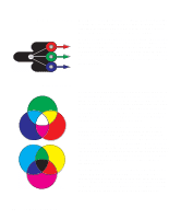
Color difference Most software applications today provide us with a WYSIWYG (What You See Is What You Get) environment. This helps us develop the look of our document. However, the difference between the additive and subtractive colors may sometimes cause a problem between what you see and what you get. This is due to the difference between additive and subtractive colors. The reason for this lies in the color spectrum of the different devices. Your printer is capable of delivering over 16 million colors. With such a large variety of colors to choose from, you'll probably be able to closely match most of your screen designs. There are however, colors your printer can produce that are impossible to duplicate on your monitor and there are colors your monitor can display that cannot be duplicated on any printer. There are many ways you can ensure the color on the screen and the color you print are the same or at least a very close match. When you create a swatch like the one to the left, you can choose and compare your printed and screen colors. The easiest way for you to get consistent color from your screen to your printer is to select standard colors. When you produce color on your screen, it is produced using a color model. A color model is a system that defines color according to a set of basic properties. Most software applications can use this color model to closely match the colors you have on your screen. As we said earlier, one simple method to aid in planning the use of color is to produce a color swatch of the colors you plan to use. Then, you can see how these colors will look when printed. As your monitor ages, the colors on the screen also change. Changing the print cartridges and paper in your printer will also have a major impact on the color in your printed document. Always print a new swatch of the colors you plan on using before you invest a lot of time creating your screen designs. Chapter 4: Understanding color 77
-
 1
1 -
2
-
3
-
4
-
5
-
6
-
7
-
8
-
9
-
10
-
11
-
12
-
13
-
14
-
15
-
16
-
17
-
18
-
19
-
20
-
21
-
22
-
23
-
24
-
25
-
26
-
27
-
28
-
29
-
30
-
31
-
32
-
33
-
34
-
35
-
36
-
37
-
38
-
39
-
40
-
41
-
42
-
43
-
44
-
45
-
46
-
47
-
48
-
49
-
50
-
51
-
52
-
53
-
54
-
55
-
56
-
57
-
58
-
59
-
60
-
61
-
62
-
63
-
64
-
65
-
66
-
67
-
68
-
69
-
70
-
71
-
72
-
73
-
74
-
75
-
76
-
77
-
78
-
79
-
80
-
81
-
82
-
83
-
84
-
85
-
 86
86 -
 87
87 -
 88
88 -
 89
89 -
 90
90 -
 91
91 -
 92
92 -
 93
93 -
 94
94 -
 95
95 -
 96
96 -
97
-
98
-
99
-
100
-
101
-
102
-
103
-
104
-
105
-
106
-
107
-
108
-
109
-
110
-
111
-
112
-
113
-
114
-
115
-
116
-
117
-
118
-
119
-
120
-
121
-
122
-
123
-
124
-
125
-
126
-
127
-
128
-
129
-
130
-
131
-
132
-
133
-
134
-
135
-
136
-
137
-
138
-
139
-
140
-
141
-
142
-
143
-
144
-
145
-
146
-
147
-
148
-
149
-
150
-
151
-
152
-
153
-
154
-
155
-
156
-
157
-
158
-
159
-
160
-
161
-
162
-
163
-
164
-
165
-
166
-
167
-
168
-
169
-
170
-
171
-
172
-
173
-
174
-
175
-
176
-
177
-
178
-
179
-
180
-
181
-
182
-
183
-
184
-
185
-
186
-
187
-
188
-
189
-
190
-
191
-
192
-
193
-
194
-
195
-
196
-
197
-
198
-
199
-
200
-
201
-
202
-
203
-
204
-
205
-
206
-
207
-
208
-
209
-
210
-
211
-
212
-
213
-
214
-
215
-
216
-
217
-
218
-
219
-
220
-
221
-
222
-
223
-
224
-
225
-
226
-
227
-
228
-
229
-
230
-
231
-
232
-
233
-
234
-
235
-
236
-
237
-
238
-
239
-
240
-
241
-
242
-
243
-
244
-
245
-
246
-
247
-
248
-
249
-
250
-
251
-
252
-
253
-
254
-
255
-
256
-
257
-
258
-
259
-
260
-
261
-
262
-
263
-
264
-
265
-
266
-
267
-
268
-
269
-
270
-
271
-
272
-
273
-
274
-
275
-
276
-
277
-
278
-
279
-
280
-
281
-
282
-
283
 |
 |
