HP 40gs HP 39gs_40gs_Mastering The Graphing Calculator_English_E_F2224-90010.p - Page 116
Registering columns as ‘in use’, Working with frequency tables, Auto scale, Enter the values
 |
UPC - 882780045217
View all HP 40gs manuals
Add to My Manuals
Save this manual to your list of manuals |
Page 116 highlights
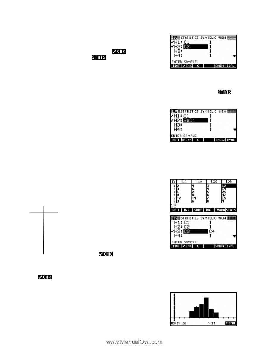
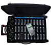
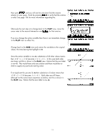
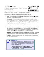
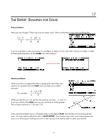
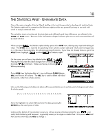
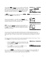
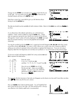
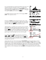
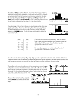
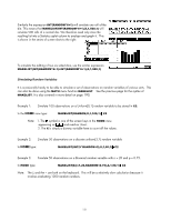
Registering columns as 'in use' Change into the SYMB view and edit yours so that it looks like the one on the right. You must make sure that H2 is ed, because only checked columns will show in the view. Note that a screen key is provided to give you the letter C without having to use the ALPHA key. The stats are should now be available for both columns of data. Return to the NUM view and press to see them. As an alternative to the method used above, you could also have created a 'virtual' column of data by using the SYMB view. Simply enter an expression giving the new column as a function of the old one. Although the 'virtual' column will not be displayed in the NUM view (and does not consume memory), it can now be graphed and analyzed statistically. You may be wondering why the SYMB view is organized around histograms H1, H2..H0 rather than simply around the columns C1, C2..C0. The reason is that it allows you to easily cope with a frequency table by setting up one column to represent values and another to represent the frequencies. If you are not using a frequency table then the frequencies are normally set, by default, to 1 as can be seen on the previous page. Working with frequency tables So how do we deal with frequency tables? Let's set up columns C3 and C4 to represent the table below. xi freq. 3 12 4 19 5 25 6 37 7 15 8 9 Enter the values 3, 4, 5, 6, 7 and 8 into C3 and then 12, 19, 25, 37, 15 and 9 into C4. Now set up your SYMB view to look like the one right. Make sure only H3 is checked. You can, if you wish, delete the definitions for H1 and H2 but make sure they are not ed. The reason for the last instruction is that only one histogram can be drawn at a time and if more than one data set is ed then only the first one is drawn. Auto scale Now use VIEWS Auto Scale to plot the graph. You will hopefully find that it looks like the one on the right. The Auto Scale function is always very effective in the Statistics aplet and is recommended. 116
-
 1
1 -
2
-
3
-
4
-
5
-
6
-
7
-
8
-
9
-
10
-
11
-
12
-
13
-
14
-
15
-
16
-
17
-
18
-
19
-
20
-
21
-
22
-
23
-
24
-
25
-
26
-
27
-
28
-
29
-
30
-
31
-
32
-
33
-
34
-
35
-
36
-
37
-
38
-
39
-
40
-
41
-
42
-
43
-
44
-
45
-
46
-
47
-
48
-
49
-
50
-
51
-
52
-
53
-
54
-
55
-
56
-
57
-
58
-
59
-
60
-
61
-
62
-
63
-
64
-
65
-
66
-
67
-
68
-
69
-
70
-
71
-
72
-
73
-
74
-
75
-
76
-
77
-
78
-
79
-
80
-
81
-
82
-
83
-
84
-
85
-
86
-
87
-
88
-
89
-
90
-
91
-
92
-
93
-
94
-
95
-
96
-
97
-
98
-
99
-
100
-
101
-
102
-
103
-
104
-
105
-
106
-
107
-
108
-
109
-
110
-
 111
111 -
 112
112 -
 113
113 -
 114
114 -
 115
115 -
 116
116 -
 117
117 -
 118
118 -
 119
119 -
 120
120 -
 121
121 -
122
-
123
-
124
-
125
-
126
-
127
-
128
-
129
-
130
-
131
-
132
-
133
-
134
-
135
-
136
-
137
-
138
-
139
-
140
-
141
-
142
-
143
-
144
-
145
-
146
-
147
-
148
-
149
-
150
-
151
-
152
-
153
-
154
-
155
-
156
-
157
-
158
-
159
-
160
-
161
-
162
-
163
-
164
-
165
-
166
-
167
-
168
-
169
-
170
-
171
-
172
-
173
-
174
-
175
-
176
-
177
-
178
-
179
-
180
-
181
-
182
-
183
-
184
-
185
-
186
-
187
-
188
-
189
-
190
-
191
-
192
-
193
-
194
-
195
-
196
-
197
-
198
-
199
-
200
-
201
-
202
-
203
-
204
-
205
-
206
-
207
-
208
-
209
-
210
-
211
-
212
-
213
-
214
-
215
-
216
-
217
-
218
-
219
-
220
-
221
-
222
-
223
-
224
-
225
-
226
-
227
-
228
-
229
-
230
-
231
-
232
-
233
-
234
-
235
-
236
-
237
-
238
-
239
-
240
-
241
-
242
-
243
-
244
-
245
-
246
-
247
-
248
-
249
-
250
-
251
-
252
-
253
-
254
-
255
-
256
-
257
-
258
-
259
-
260
-
261
-
262
-
263
-
264
-
265
-
266
-
267
-
268
-
269
-
270
-
271
-
272
-
273
-
274
-
275
-
276
-
277
-
278
-
279
-
280
-
281
-
282
-
283
-
284
-
285
-
286
-
287
-
288
-
289
-
290
-
291
-
292
-
293
-
294
-
295
-
296
-
297
-
298
-
299
-
300
-
301
-
302
-
303
-
304
-
305
-
306
-
307
-
308
-
309
-
310
-
311
-
312
-
313
-
314
-
315
-
316
-
317
-
318
-
319
-
320
-
321
-
322
-
323
-
324
-
325
-
326
-
327
-
328
-
329
-
330
-
331
-
332
-
333
-
334
-
335
-
336
-
337
-
338
-
339
-
340
-
341
-
342
-
343
-
344
-
345
-
346
-
347
-
348
-
349
-
350
-
351
-
352
-
353
-
354
-
355
-
356
-
357
-
358
-
359
-
360
-
361
-
362
-
363
-
364
-
365
-
366
 |
 |