| Section |
Page |
| Title Page |
1 |
| Introduction |
7 |
| The hp 39gs vs. the hp 40gs |
7 |
| Getting Started |
9 |
| Some Keyboard Examples |
10 |
| Keys & Notation Conventions |
11 |
| The SHIFT and ALPHA keys |
11 |
| The ALPHA key |
11 |
| The Screen keys |
12 |
| Pop-up menus & short-cuts |
12 |
| Everything revolves around Aplets! |
14 |
| The Finance aplet (see page 155) |
14 |
| The Function aplet (see page 46) |
14 |
| The Inference aplet (see page 141) |
14 |
| The Linear Solver aplet (see page 150 ) |
14 |
| The Parametric aplet (see page 92) |
14 |
| The Polar aplet (see page 98) |
14 |
| The Quadratic Explorer aplet (see page 159) |
14 |
| The Sequence aplet (see page 99) |
15 |
| The Solve aplet (see page 105) |
15 |
| The Statistics aplet (see page 114 & 123) |
15 |
| The Triangle Solve aplet (see page 152 ) |
15 |
| The Trig Explorer aplet (see page 162) |
15 |
| Some typical aplet views |
15 |
| The HOME view |
18 |
| What is the HOME view? |
18 |
| Exploring the keyboard |
19 |
| The screen keys |
19 |
| Aplet related keys |
19 |
| The arrow keys |
19 |
| The SYMB, PLOT and NUM keys |
20 |
| Intro to the VIEWS menu |
21 |
| The VARS key |
22 |
| The SETUP views |
23 |
| The MODES view |
24 |
| Numeric formats |
24 |
| The ANS key |
26 |
| The negative key |
26 |
| The CHARS key |
26 |
| The DEL and CLEAR keys |
27 |
| Angle and Numeric settings |
28 |
| Memory Management |
30 |
| The MEMORY MANAGER view |
30 |
| Downloaded aplets & memory |
31 |
| The GRAPHICS MANAGER |
32 |
| The LIBRARY MANAGER |
32 |
| Fractions on the hp 39gs and hp 40gs |
33 |
| Pitfalls in Fraction mode |
35 |
| The HOME History |
37 |
| COPYing calculations |
37 |
| Clearing the History |
37 |
| SHOWing results |
38 |
| Storing and Retrieving Memories |
39 |
| Referring to other aplets from the HOME view. |
40 |
| A brief introduction to the MATH Menu |
41 |
| Resetting the calculator |
42 |
| Summary |
45 |
| The Function Aplet |
46 |
| Choose the aplet |
46 |
| The SYMB view |
47 |
| The XT button |
47 |
| ing your function |
47 |
| The NUM view |
48 |
| The PLOT view |
48 |
| Auto Scale |
49 |
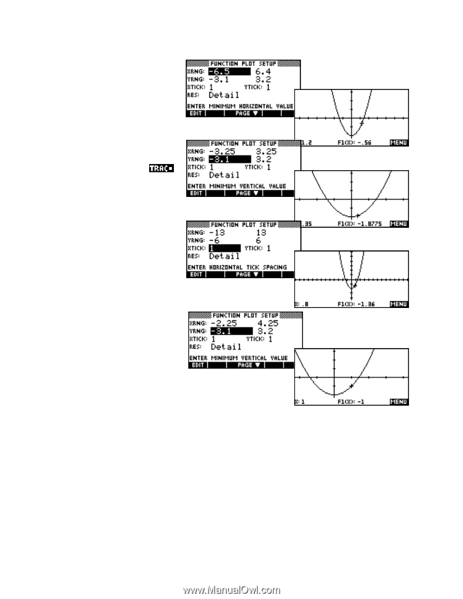
| The PLOT SETUP view |
50 |
| Detail vs. Faster |
50 |
| Simultaneous |
51 |
| Connect |
51 |
| Axes |
51 |
| Labels |
51 |
| Grid |
51 |
| The default axis settings |
52 |
| The Bar |
52 |
| The MENU toggle |
52 |
| The Menu Bar functions |
53 |
| Trace |
53 |
| Defn |
53 |
| Goto |
54 |
| The Zoom Sub-menu |
55 |
| Center |
55 |
| In/Out |
55 |
| Box… |
55 |
| X-Zoom In/Out x4 and Y-Zoom In/Out x4 |
56 |
| Square |
56 |
| Auto Scale, Decimal, Integer and Trig |
56 |
| The FCN menu |
57 |
| Root |
57 |
| Intersection |
58 |
| Slope |
58 |
| Signed area… |
59 |
| Definite integrals |
59 |
| Tracing the integral in PLOT |
60 |
| Areas between and under curves |
61 |
| Extremum |
61 |
| The Expert: Working with Functions Effectively |
62 |
| Finding a suitable set of axes |
62 |
| Composite functions |
64 |
| Using functions in the HOME view |
65 |
| Differentiating |
66 |
| Circular functions |
67 |
| Trig functions |
69 |
| Retaining calculated values |
70 |
| The NUM view revisited |
70 |
| NumStart & NumStep |
70 |
| Automatic vs. Build Your Own |
71 |
| ZOOM |
71 |
| Integration: The definite integral using the function |
72 |
| Integration: The algebraic indefinite integral |
73 |
| A caveat when integrating symbolically… |
74 |
| Integration: The definite integral using PLOT variables |
75 |
| Piecewise defined functions |
77 |
| ‘Nice’ scales |
78 |
| Nice scales in the PLOT-TABLE view |
79 |
| Use of brackets in functions |
79 |
| Problems when evaluating limits |
80 |
| Gradient at a point as the limit of the slope of a chord |
83 |
| Finding and accessing polynomial roots |
84 |
| The VIEWS menu |
85 |
| Plot-Detail |
86 |
| Plot-Table |
87 |
| Nice table values |
88 |
| Overlay Plot |
88 |
| Auto Scale |
89 |
| Decimal, Integer & Trig |
89 |
| Downloaded Aplets from the Internet |
91 |
| Curve Areas |
91 |
| Linear Programming |
91 |
| Sine Define |
91 |
| Periodic Table |
91 |
| The Parametric Aplet |
92 |
| Choose XRng, YRng & TRng |
92 |
| The effect of TRng |
93 |
| TStep controls smoothness |
93 |
| The Expert: Vector Functions |
95 |
| Fun and games |
95 |
| Example 1 |
95 |
| Example 2 |
95 |
| Example 2 |
95 |
| Vectors |
96 |
| Example 1 |
96 |
| Example 2 |
97 |
| The Polar Aplet |
98 |
| Choose XRng, YRng & Rng |
98 |
| Step and smoothness |
98 |
| Changing the default for Step |
98 |
| Circular circles |
98 |
| The Sequence Aplet |
99 |
| Recursive or non-recursive |
99 |
| First, second & general terms |
99 |
| Convenient screen keys provided |
100 |
| The Expert: Sequences & Series |
102 |
| Defining a generalized GP and the sum to n terms for it. |
102 |
| Solving sequence problems |
102 |
| Modeling loans |
104 |
| The Solve Aplet |
105 |
| Equations vs. expressions |
105 |
| Entering the equation |
105 |
| Solving for a missing value |
106 |
| The INFO report |
106 |
| Multiple solutions and the initial guess |
107 |
| Example 1 |
107 |
| Example 2 |
107 |
| Graphing in Solve |
107 |
| Transferring approximate solutions |
108 |
| Referring to functions from other aplets |
108 |
| Example 3 |
108 |
| Example 4 |
109 |
| A detailed explanation of PLOT in Solve |
110 |
| The meaning of messages |
112 |
| The Expert: Examples for Solve |
113 |
| Easy problems |
113 |
| Harder problems |
113 |
| The Statistics Aplet - Univariate Data |
114 |
| Uni-variate vs. Bi-variate data |
114 |
| Clearing data |
114 |
| Sorting data |
115 |
| The STATS key |
115 |
| Functions of columns |
115 |
| Registering columns as ‘in use’ |
116 |
| Working with frequency tables |
116 |
| Auto scale |
116 |
| Plot Setup options |
117 |
| Box and whisker graphs |
117 |
| The effect of HRng |
118 |
| Grouped data & HWidth |
118 |
| Centering columns in the histogram |
119 |
| The Expert: Simulations & random numbers |
120 |
| New columns as functions of old |
120 |
| Simulating Dice |
120 |
| Simulation of a normal die |
121 |
| Simulating Random Variables |
121 |
| The Statistics Aplet - Bivariate Data |
123 |
| Uni vs. Bi-variate data |
123 |
| Clearing data |
123 |
| Sorting paired columns |
124 |
| Entering data as ordered pairs |
124 |
| Adjusting the symbols used to plot points |
124 |
| The cursor |
125 |
| Specifying the fit model |
125 |
| Multiple data sets |
125 |
| Choosing from available fit models |
126 |
| The User Defined model |
127 |
| Connected data |
127 |
| Two Variable Statistics |
128 |
| Showing the line of best fit |
129 |
| A caveat for bivariate data |
130 |
| Predicting using PREDY |
130 |
| Predicting using the PLOT view |
131 |
| RelErr as a measure of non-linear fit |
131 |
| The Expert: Manipulating columns & eqns |
133 |
| New columns as functions of old |
133 |
| Using values from in calculations |
133 |
| Obtaining coefficients from the fit model |
135 |
| Finding Fit Coefficients |
135 |
| Correct interpretation of the PREDX function |
136 |
| Assigning rank orders to sets of data |
137 |
| Using Stats to find equations from point data |
138 |
| The Inference Aplet |
141 |
| Hypothesis test: T-Test 1- |
141 |
| Confidence interval: T-Int 1- |
143 |
| Hypothesis test: T-Test - |
144 |
| Hypothesis test: Z-Test 1- |
145 |
| The Expert: Chi2 tests & Frequency tables |
147 |
| Using the Chi2 test on a frequency table |
147 |
| Importing from a frequency table |
148 |
| The Linear Solver Aplet |
150 |
| Example 1 |
150 |
| Example 2 |
150 |
| Example 3 |
151 |
| The Triangle Solve Aplet |
152 |
| Example 1 |
152 |
| Example 2 |
153 |
| Example 3 |
154 |
| The Finance Aplet |
155 |
| Parameters |
155 |
| Ordinary compound interest |
156 |
| Annuities |
157 |
| Loan calculations |
157 |
| Amortization |
158 |
| The Quad Explorer Teaching Aplet |
159 |
| Objectives |
159 |
| Choosing the level |
159 |
| GRAPH mode |
159 |
| SYMB mode |
160 |
| Test mode |
160 |
| The Trig Explorer Teaching Aplet |
162 |
| Objectives |
162 |
| SIN vs. COS |
162 |
| SYMB vs. GRPH mode |
162 |
| The PLOT mode |
163 |
| The SYMB mode |
163 |
| The MATH menus |
165 |
| Accessing the MATH menu commands |
166 |
| The PHYS menu commands |
168 |
| Chemistry |
168 |
| Physics |
168 |
| Quantum Physics |
168 |
| The MATH menu commands |
169 |
| The ‘Real’ group of functions |
170 |
| CEILING(<num>) |
170 |
| DEGRAD(<deg>) |
170 |
| FLOOR(<num>) |
170 |
| FNROOT(<expression>,<variable>,<guess>) |
171 |
| FRAC(<num>) |
171 |
| HMS (<dd.mmss>) |
172 |
| HMS(<num>) |
172 |
| INT(<num>) |
173 |
| MANT(<num>) |
173 |
| MAX(num1,num2) |
173 |
| MIN(num1,num2) |
174 |
| <num> MOD <divisor> |
174 |
| % function(<num1>,<num2>) |
174 |
| %CHANGE(<num1>,<num2>) |
175 |
| %TOTAL(<num1>,<num2>) |
175 |
| RADDEG(<radian_measure>) |
175 |
| ROUND(<num>,<dec.pts>) |
176 |
| SIGN(<num>) |
176 |
| TRUNCATE(<num>) |
177 |
| XPON(<num>) |
177 |
| The ‘Stat-Two’ group of functions |
178 |
| PREDY(<x-value>) |
178 |
| PREDX(<y-value>) |
178 |
| The ‘Symbolic’ group of functions |
179 |
| The = ‘function’ |
179 |
| ISOLATE(<expression>,<var-name>) |
179 |
| LINEAR?(<expression>,<var.name>) |
180 |
| QUAD(<expression>,<var.name>) |
180 |
| QUOTE(<var_name>) |
181 |
| The | function written as: <expression> | (var1=valu |
181 |
| The ‘Tests’ group of functions |
182 |
| The ‘Trigonometric’ & ‘Hyperbolic’ groups of functions |
182 |
| COT, SEC etc |
182 |
| EXP(<num>) |
183 |
| ALOG(<num>) |
183 |
| EXPM1(<num>) |
183 |
| LNP1(<num>) |
184 |
| The ‘Calculus’ group of functions |
184 |
| (<num>,<num>,<expression>,<var_name>) |
184 |
| <var_name>(<expression>) |
184 |
| TAYLOR(<expression>,<var_name>,<num>) |
185 |
| The ‘Complex’ group of functions |
186 |
| ABS(<real>) or ABS(<complex>) |
187 |
| SIGN(<real>) or SIGN(<complex>) |
187 |
| ARG(<complex>) or ARG(<vector>) |
187 |
| CONJ(<complex>) |
188 |
| IM(<complex>) |
188 |
| and RE(complex) |
188 |
| The ‘Constant’ group of functions |
189 |
| The ‘Convert’ group of functions |
189 |
| The ‘List’ group of functions |
190 |
| CONCAT(<list1>, <list2>) |
190 |
| LIST(<list>) |
190 |
| MAKELIST(<expression>,<var_name>,<num>,<num>,<num>) |
190 |
| LIST(<list>) |
191 |
| POS(<list>,<num>) |
191 |
| SIZE(<list>) or SIZE(<matrix>) |
192 |
| LIST(<list>) |
192 |
| REVERSE(<list>) |
192 |
| SORT({list}) |
192 |
| The ‘Loop’ group of functions |
193 |
| ITERATE(<expression>,<var_name>,<num>,<num>) |
193 |
| RECURSE |
194 |
| (<var_name>,<num>,<num>,<expression>) |
194 |
| The ‘Matrix’ group of functions |
195 |
| COLNORM(<matrix>) |
195 |
| COND(<matrix>) |
195 |
| CROSS([vector],[vector]) |
195 |
| DET(<matrix>) |
196 |
| DOT([vector],[vector]) |
196 |
| EIGENVAL(<matrix>) |
196 |
| EIGENVV(<matrix>) |
196 |
| IDENTMAT(<size>) |
196 |
| INVERSE(<matrix>) |
197 |
| LQ(<matrix>) |
197 |
| LSQ(<matrix1>,<matrix2>) |
198 |
| LU(<matrix>) |
198 |
| MAKEMAT(<expression>,<rows>,<columns>) |
198 |
| QR(<matrix>) |
198 |
| RANK(<matrix>) |
198 |
| ROWNORM(<matrix>) |
199 |
| RREF(<matrix>) |
199 |
| SCHUR(<matrix>) |
200 |
| SIZE(<list>) or SIZE(<matrix>) |
200 |
| SPECNORM(<matrix>) |
200 |
| SPECRAD(<matrix>) |
200 |
| SVD(<matrix>) |
201 |
| SVL(<matrix>) |
201 |
| TRACE(<matrix>) |
201 |
| TRN(matrix) |
201 |
| The ‘Polynomial’ group of functions |
202 |
| POLYCOEF([root1,root2,…]) |
202 |
| POLYEVAL([coeff1,coeff2,…],value) |
202 |
| POLYFORM(<expression>,<var_name>) |
203 |
| POLYROOT([coeff1,coeff2,…]) |
204 |
| The ‘Probability’ group of functions |
205 |
| COMB(<n>,<r>) |
205 |
| The ! function |
205 |
| PERM(<n>,<r>) |
206 |
| RANDOM |
206 |
| RANDSEED(<number>) |
206 |
| UTPN(<mean>,<variance>,<value>) |
207 |
| UTPC(<degrees>,<value>) |
208 |
| UTPF(<numerator>,<denominator>,<value>) |
208 |
| UTPT(<degrees>,<value>) |
208 |
| Working with Matrices |
209 |
| The MATRIX Catalog |
209 |
| Matrix calculations in the HOME view |
210 |
| Solving a system of equations |
211 |
| Finding an inverse matrix |
213 |
| The dot product |
214 |
| Working with Lists |
215 |
| The list variables |
215 |
| Operations on lists |
215 |
| Statistical columns as lists |
215 |
| List functions |
216 |
| Editing a list |
216 |
| Operations on elements |
216 |
| Working with Notes & the Notepad |
217 |
| Aplet notes vs. independent notes |
217 |
| Independent Notes and the Notepad Catalog |
219 |
| Transferring notes using IR |
219 |
| Editing software |
219 |
| Creating a Note |
220 |
| Locking ALPHA mode |
220 |
| The CHARS view |
221 |
| Corrupting notes |
221 |
| Working with Sketches |
222 |
| Adding text to a sketch |
222 |
| The DRAW menu |
223 |
| DOT+ |
223 |
| LINE |
223 |
| BOX |
223 |
| CIRCLE |
224 |
| Cut and paste images |
224 |
| Storing to a GROB |
224 |
| Using the VAR key to paste |
224 |
| Simple Animations |
225 |
| Capturing the PLOT screen |
225 |
| Copying & Creating aplets on the calculator |
226 |
| Different models use different methods to communicate |
227 |
| Sending/Receiving via the infra-red link or cable. |
228 |
| Creating a copy of a Standard aplet. |
230 |
| Copying and adding to the Function aplet |
230 |
| Copying and adding to the Stats aplet |
231 |
| Some examples of saved aplets |
232 |
| The Triangles aplet |
232 |
| The Prob. Distributions aplet |
232 |
| The Transformer aplet |
234 |
| Storing aplets & notes to the PC |
237 |
| Overview |
237 |
| Software is required to link to a PC |
238 |
| For the hp 38g, hp 39g & hp 40g |
238 |
| For the hp 39g+, hp 39gs and hp 40gs |
238 |
| Both models use the same cable |
239 |
| Sending from calculator to PC |
239 |
| Time out |
242 |
| Attached programs |
243 |
| Receiving from PC to calculator |
244 |
| Aplets from the Internet |
245 |
| Finding aplets |
245 |
| The HP39DIR files |
246 |
| Organizing your collection |
247 |
| Using downloaded aplets |
249 |
| Deleting downloaded aplets from the calculator |
250 |
| Capturing screens using the Connectivity Kit |
251 |
| Capturing into the Sketch view |
251 |
| Editing Notes using the Connectivity Software |
252 |
| Programming the hp 39gs & hp 40gs |
255 |
| The design process |
255 |
| An overview |
255 |
| Choosing the parent aplet |
256 |
| Working with Software vs Working on the Calculator |
256 |
| Naming conventions |
256 |
| Planning the VIEWS menu |
257 |
| The SETVIEWS command |
259 |
| Special entries in the SETVIEWS command |
260 |
| The ‘Start’ entry |
261 |
| Example aplet #1 – Displaying info |
262 |
| Example aplet #2 – The Transformer Aplet |
268 |
| Designing aplets on a PC |
270 |
| Example program “Log X (base b)” |
270 |
| Example aplet #3 – Transformer revisited |
272 |
| Example aplet #4 – The Linear Explorer aplet |
274 |
| Analysing the aplet |
276 |
| Alternatives to HP Basic Programming |
281 |
| The sRPL programming language |
281 |
| The HPG-CC Programming language |
282 |
| Flash ROM |
284 |
| Programming Commands |
286 |
| The Aplet commands |
286 |
| CHECK n, UNCHECK n |
286 |
| SELECT <name> |
286 |
| SETVIEWS <prompt>;<program>;<view number> |
286 |
| The Branch commands |
287 |
| IF <test> THEN <true clause> [ELSE <false clause>] END |
287 |
| CASE <if clauses> …END: |
287 |
| IFFERR <statements> THEN <statements> [ELSE <statements>] EN |
287 |
| RUN <program name> |
288 |
| STOP |
288 |
| The Drawing commands |
289 |
| ARC <x-center>;<y-center>;<radius>;<start angle>;<end angle> |
289 |
| BOX <x1>;<y1>;<x2>;<y2> |
289 |
| ERASE |
289 |
| FREEZE |
289 |
| LINE <x1>;<y1>;<x2>;<y2> |
289 |
| PIXON <x>;<y> and PIXOFF <x>;<y> |
289 |
| TLINE <x1>;<y1>;<x2>;<y2> |
290 |
| The Graphics commands |
291 |
| The Loop commands |
291 |
| FOR <variable> = <start value> TO � <end value> [STEP <incr |
291 |
| DO <statements> UNTIL <test clause> END |
291 |
| WHILE <test clause> REPEAT <statements> END |
291 |
| BREAK |
292 |
| The Matrix commands |
292 |
| EDITMAT <matrix var> |
292 |
| REDIM <matrix var>;<size> |
292 |
| The Print commands |
293 |
| PRDISPLAY |
293 |
| PRHISTORY |
293 |
| PRVAR <variable> |
293 |
| The Prompt commands |
294 |
| BEEP <frequency>;<duration> |
294 |
| CHOOSE <variable>;<title>;<menu option1>;…. |
294 |
| DISP <line number>;<expression> |
295 |
| DISPXY <xpos>;<ypos>;<font>;<expression> |
295 |
| DISPTIME |
296 |
| GETKEY <variable> |
296 |
| INPUT <variable>;<title>;<prompt>;<message>;<default value> |
296 |
| MSGBOX <expression> |
296 |
| PROMPT <variable> |
296 |
| WAIT <duration> |
297 |
| Appendix A: Some Worked Examples |
298 |
| Finding the intercepts of a quadratic |
298 |
| Method 1 - Using the QUAD function in HOME. |
298 |
| Method 2 - Using the Function aplet. |
298 |
| Method 3 - Using the POLYROOT function |
299 |
| Finding complex solutions to a complex equation |
299 |
| Method 1 - Using the QUAD function |
299 |
| Method 2 - Using POLYROOT |
299 |
| Method 3 - Using the CAS on the hp 40gs |
299 |
| Finding critical points and graphing a polynomial |
300 |
| Solving simultaneous equations. |
302 |
| Method 1 - Graphing the lines |
302 |
| Method 2 - Using a matrix |
302 |
| Method 3 - Using the Linear Solver aplet |
303 |
| Expanding polynomials |
304 |
| Exponential growth |
305 |
| Solution of matrix equations |
307 |
| Finding complex roots |
308 |
| Complex Roots on the hp 40gs |
309 |
| Analyzing vector motion and collisions |
310 |
| Circular Motion and the Dot Product |
311 |
| Inference testing using the Chi2 test |
312 |
| Appendix B: Teaching or Learning Calculus |
314 |
| Investigating the graphs of y=xn for n an integer |
314 |
| Domains and Composite Functions |
315 |
| Gradient at a Point |
317 |
| Gradient Function |
318 |
| The Chain Rule |
319 |
| Optimization |
319 |
| Area Under Curves |
320 |
| Fields of Slopes and Curve Families |
320 |
| Inequalities |
321 |
| Rectilinear Motion |
321 |
| Limits |
321 |
| Piecewise Defined Functions |
322 |
| Sequences and Series |
322 |
| Transformations of Graphs |
323 |
| Appendix C: The CAS on the hp 40gs |
324 |
| Introduction |
324 |
| What is a CAS? |
324 |
| What is the difference between the hp 39g, hp 40g, hp 39g+ a |
326 |
| Using the CAS |
327 |
| The current variable |
327 |
| Defining new variables |
328 |
| Entering and editing an expression |
328 |
| Special characters |
333 |
| Special editing commands – Undo, multi-select & swap |
334 |
| In-line editing mode |
335 |
| Cursor mode |
335 |
| Changing Font |
336 |
| Erasing, copying, cutting and pasting |
336 |
| The CAS HOME History |
337 |
| Viewing results |
337 |
| The PUSH and POP commands |
338 |
| Pasting to an aplet |
338 |
| Evaluating algebraic expressions |
339 |
| Examples using the CAS |
341 |
| Example 1: Simplifying a fraction with working |
341 |
| Example 2: Simplifying surds |
342 |
| Example 3: Using lim |
343 |
| Example 4: Factorizing expressions |
345 |
| Example 5: Solving equations |
346 |
| Example 6: Solving simultaneous equations |
346 |
| Example 7: Solving a simultaneous integration |
348 |
| Example 8: Defining a user function |
350 |
| Example 9: Investigation of a complex function |
352 |
| Example 10: First order linear differential equation |
357 |
| The CAS menus |
358 |
| The Screen menus |
358 |
| The MATH menu |
359 |
| The CMDS menu |
360 |
| On-line help |
361 |
| Configuring the CAS |
362 |
| Approximate vs. Exact mode |
363 |
| Num. Factor mode |
364 |
| Complex vs. Real mode |
364 |
| Verbose vs. nonverbose mode |
364 |
| Step-by-step mode |
364 |
| Increasing-powers mode |
365 |
| Rigorous setting |
365 |
| Simplify non-rational setting |
365 |

 1
1 73
73 74
74 75
75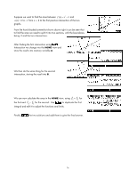 76
76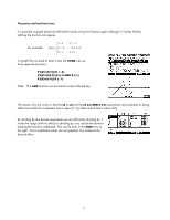 77
77 78
78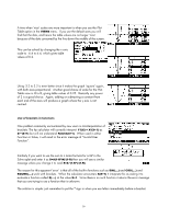 79
79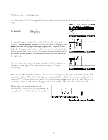 80
80 81
81 82
82 83
83