Brother International PDP350CJ Owner's Manual - English - Page 193
ypes of Charts, Column chart
 |
View all Brother International PDP350CJ manuals
Add to My Manuals
Save this manual to your list of manuals |
Page 193 highlights
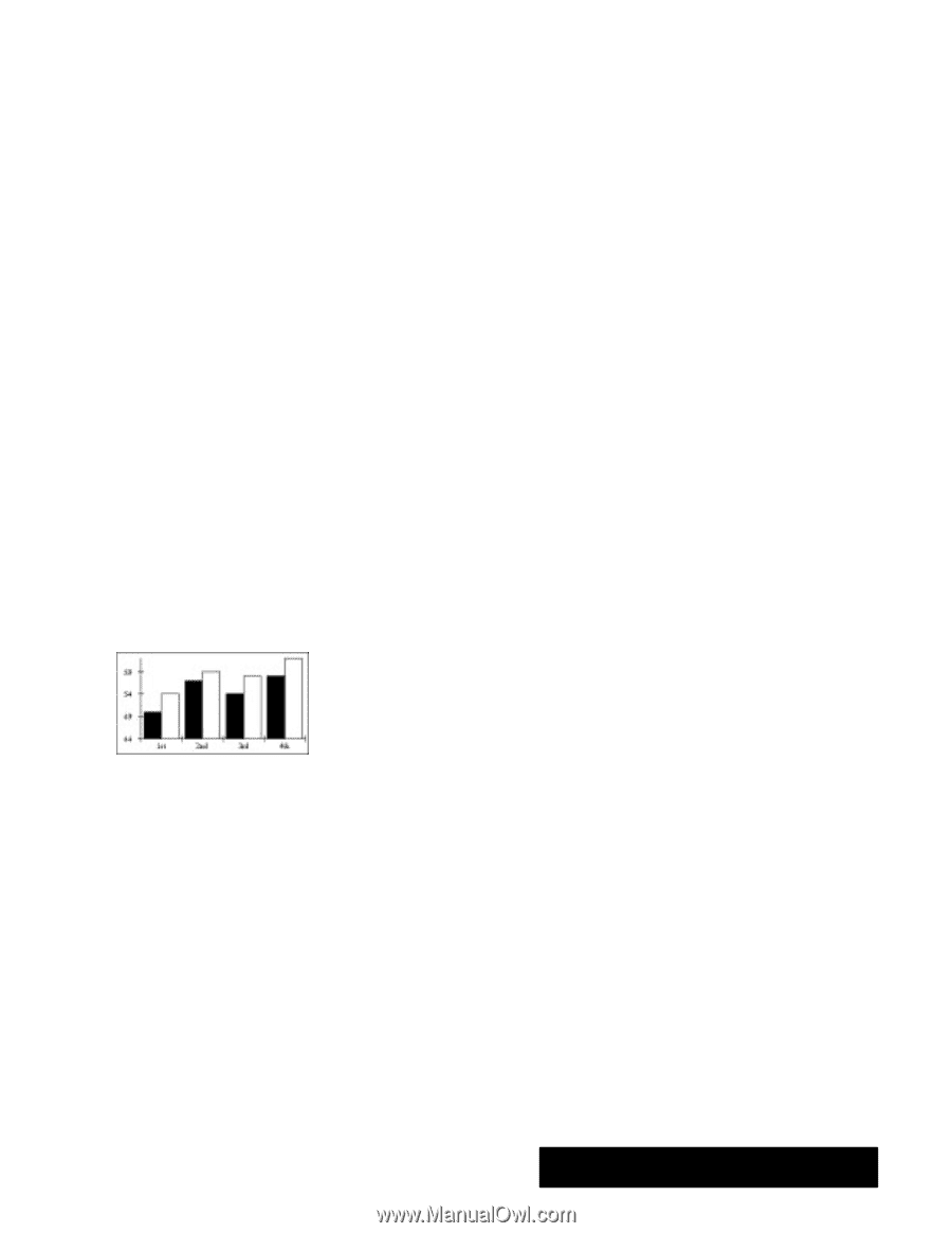
Do not use numbers for the chart title, series names, or category names. For example, instead of naming categories 1, 2, and 3, use something like Day 1, Day 2 and Day 3. If you must use a number, like 1993 and 1994, place a quote mark (') before the number so Spreadsheet interprets it as text. Chart Title. The title of the chart. This label is optional. If you do not place any text in this cell, the chart will not be titled. You can title it later using the Titles and Legends choice on the Chart menu. Series Name. The series names are the labels of the spreadsheet columns. Category Name. The category names are the labels of the spreadsheet rows. Value. The numeric data values Spreadsheet charts. Each category you wish to chart should have at least one value for each series. Empty cells in your spreadsheet will be interpreted as zeros in your chart. Types of Charts All but the High/Low chart offer variations you can choose once you have created the chart. Each of the seven standard charts is illustrated in the following sections. Spreadsheet lets you create the following types of charts: S Column S Bar S Line S Area S X-Y Plot S Pie S High/Low Column chart A column chart (or a vertical bar chart) plots each category in a series as a vertical bar. The height of the bar corresponds to the value of that category. The illustration at the left shows a typical column chart. Use bar charts for comparing amounts for fixed time intervals. Variations on the standard column chart include the following: S Overlapped. The columns within each category overlap each other slightly. S Stacked. The columns within each category are stacked vertically on top of each other. The height of the stacked column is the sum of the values in the category. S Stacked Percentage. The columns in each category are stacked so that the total height represents 100%. The height of each value is shown as that value's percentage of the whole category. This is like a vertical pie chart. S One Tone With Values. Columns all have the same tone and are labeled with their numeric values. S One Tone With No Space Between Categories. Columns all have the same tone, and the last column in category 1 touches the first column in category 2 with no space between them. Spreadsheet 179
-
 1
1 -
2
-
3
-
4
-
5
-
6
-
7
-
8
-
9
-
10
-
11
-
12
-
13
-
14
-
15
-
16
-
17
-
18
-
19
-
20
-
21
-
22
-
23
-
24
-
25
-
26
-
27
-
28
-
29
-
30
-
31
-
32
-
33
-
34
-
35
-
36
-
37
-
38
-
39
-
40
-
41
-
42
-
43
-
44
-
45
-
46
-
47
-
48
-
49
-
50
-
51
-
52
-
53
-
54
-
55
-
56
-
57
-
58
-
59
-
60
-
61
-
62
-
63
-
64
-
65
-
66
-
67
-
68
-
69
-
70
-
71
-
72
-
73
-
74
-
75
-
76
-
77
-
78
-
79
-
80
-
81
-
82
-
83
-
84
-
85
-
86
-
87
-
88
-
89
-
90
-
91
-
92
-
93
-
94
-
95
-
96
-
97
-
98
-
99
-
100
-
101
-
102
-
103
-
104
-
105
-
106
-
107
-
108
-
109
-
110
-
111
-
112
-
113
-
114
-
115
-
116
-
117
-
118
-
119
-
120
-
121
-
122
-
123
-
124
-
125
-
126
-
127
-
128
-
129
-
130
-
131
-
132
-
133
-
134
-
135
-
136
-
137
-
138
-
139
-
140
-
141
-
142
-
143
-
144
-
145
-
146
-
147
-
148
-
149
-
150
-
151
-
152
-
153
-
154
-
155
-
156
-
157
-
158
-
159
-
160
-
161
-
162
-
163
-
164
-
165
-
166
-
167
-
168
-
169
-
170
-
171
-
172
-
173
-
174
-
175
-
176
-
177
-
178
-
179
-
180
-
181
-
182
-
183
-
184
-
185
-
186
-
187
-
 188
188 -
 189
189 -
 190
190 -
 191
191 -
 192
192 -
 193
193 -
 194
194 -
 195
195 -
 196
196 -
 197
197 -
 198
198 -
199
-
200
-
201
-
202
-
203
-
204
-
205
-
206
-
207
-
208
-
209
-
210
-
211
-
212
-
213
-
214
-
215
-
216
-
217
-
218
-
219
-
220
-
221
-
222
-
223
-
224
-
225
-
226
-
227
-
228
-
229
-
230
-
231
-
232
-
233
-
234
-
235
-
236
-
237
-
238
-
239
-
240
-
241
-
242
-
243
-
244
-
245
-
246
-
247
-
248
-
249
-
250
-
251
-
252
-
253
-
254
-
255
-
256
-
257
-
258
-
259
-
260
-
261
-
262
-
263
-
264
-
265
-
266
-
267
-
268
-
269
-
270
-
271
-
272
-
273
-
274
-
275
-
276
-
277
-
278
-
279
-
280
-
281
-
282
-
283
-
284
-
285
-
286
-
287
-
288
-
289
-
290
-
291
-
292
-
293
-
294
-
295
-
296
-
297
-
298
-
299
-
300
-
301
-
302
-
303
-
304
-
305
-
306
-
307
-
308
-
309
-
310
-
311
-
312
-
313
-
314
-
315
-
316
-
317
-
318
-
319
-
320
-
321
-
322
-
323
-
324
-
325
-
326
-
327
-
328
-
329
-
330
-
331
-
332
-
333
-
334
-
335
-
336
-
337
-
338
-
339
-
340
-
341
-
342
-
343
-
344
-
345
-
346
-
347
-
348
-
349
-
350
-
351
-
352
-
353
-
354
-
355
-
356
-
357
-
358
-
359
-
360
-
361
-
362
-
363
-
364
-
365
-
366
-
367
-
368
-
369
-
370
-
371
-
372
-
373
-
374
-
375
-
376
-
377
-
378
-
379
-
380
-
381
-
382
-
383
-
384
-
385
-
386
-
387
-
388
-
389
-
390
-
391
-
392
-
393
-
394
-
395
-
396
-
397
-
398
-
399
-
400
-
401
-
402
-
403
-
404
-
405
-
406
-
407
-
408
-
409
-
410
-
411
-
412
-
413
-
414
-
415
-
416
-
417
-
418
-
419
-
420
-
421
-
422
-
423
-
424
-
425
-
426
-
427
-
428
-
429
-
430
-
431
-
432
-
433
-
434
-
435
-
436
-
437
-
438
-
439
-
440
 |
 |