Brother International PDP350CJ Owner's Manual - English - Page 195
Area chart, X-Y Plot chart, Stacked Percentage., Drop Lines., Series Name., Lines Only., Markers Only.
 |
View all Brother International PDP350CJ manuals
Add to My Manuals
Save this manual to your list of manuals |
Page 195 highlights
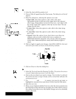
Area chart This chart can only be plotted using rows. Each of the data points on a horizontal row will be plotted on the same line. An area chart is a line chart in which the area below the line is filled with a pattern or solid tone. The illustrations below show a typical line chart.. The chart on the left shows the result when the data is entered horizontally. The one on the right shows the result when the data is entered vertically. Use line charts for trends. X-Y Plot chart Do not plot more than 12 items per chart. This type of chart can only be plotted using rows. Each of the data points on a horizontal row will be plotted together. Variations on the standard area chart include the following: S Stacked Percentage. Like the column stacked percentage chart, this area chart shows the areas for each category stacked to a constant height representing 100%, and the values are shown as percentages. S Drop Lines. Draws a vertical line to connect the points in each category. S Series Name. Draws the name of each series in the center of its filled area. An X-Y plot chart, sometimes called a scatter plot, looks similar to a line chart, but there is a significant difference between the two. Line charts plot a value against a label (see the line chart on page 180), whereas X-Y plot charts plot one value against another. X-Y plot charts are unique in that they take categories two rows at a time and plot them against each other. Remember X-Y plots compare two or more categories. Use X-Y plots to show cause and effect. Another difference between X-Y plot charts and line charts is that on an X-Y plot chart, the tick marks along each axis (X is the horizontal axis, Y the vertical) are spaced according to their value, which may not always be at regular intervals because of the potentially random nature of the data. On a line chart, one axis always contains text labels which are usually evenly spaced for visual clarity. Variations on the standard X-Y plot chart include the following: S Lines Only. Draws only the lines connecting the points in each series; does not draw the markers for each point. S Markers Only. Draws only the markers for each point; does not connect the markers with lines. This choice makes an X-Y plot that looks like a traditional scatter plot. Scatter plots are primarily used to see where the different data is grouping. For instance, the age of most of your group will be apparent if you use a scatter plot since the markers will congregate in one area primarily. Spreadsheet 181
-
 1
1 -
2
-
3
-
4
-
5
-
6
-
7
-
8
-
9
-
10
-
11
-
12
-
13
-
14
-
15
-
16
-
17
-
18
-
19
-
20
-
21
-
22
-
23
-
24
-
25
-
26
-
27
-
28
-
29
-
30
-
31
-
32
-
33
-
34
-
35
-
36
-
37
-
38
-
39
-
40
-
41
-
42
-
43
-
44
-
45
-
46
-
47
-
48
-
49
-
50
-
51
-
52
-
53
-
54
-
55
-
56
-
57
-
58
-
59
-
60
-
61
-
62
-
63
-
64
-
65
-
66
-
67
-
68
-
69
-
70
-
71
-
72
-
73
-
74
-
75
-
76
-
77
-
78
-
79
-
80
-
81
-
82
-
83
-
84
-
85
-
86
-
87
-
88
-
89
-
90
-
91
-
92
-
93
-
94
-
95
-
96
-
97
-
98
-
99
-
100
-
101
-
102
-
103
-
104
-
105
-
106
-
107
-
108
-
109
-
110
-
111
-
112
-
113
-
114
-
115
-
116
-
117
-
118
-
119
-
120
-
121
-
122
-
123
-
124
-
125
-
126
-
127
-
128
-
129
-
130
-
131
-
132
-
133
-
134
-
135
-
136
-
137
-
138
-
139
-
140
-
141
-
142
-
143
-
144
-
145
-
146
-
147
-
148
-
149
-
150
-
151
-
152
-
153
-
154
-
155
-
156
-
157
-
158
-
159
-
160
-
161
-
162
-
163
-
164
-
165
-
166
-
167
-
168
-
169
-
170
-
171
-
172
-
173
-
174
-
175
-
176
-
177
-
178
-
179
-
180
-
181
-
182
-
183
-
184
-
185
-
186
-
187
-
188
-
189
-
 190
190 -
 191
191 -
 192
192 -
 193
193 -
 194
194 -
 195
195 -
 196
196 -
 197
197 -
 198
198 -
 199
199 -
 200
200 -
201
-
202
-
203
-
204
-
205
-
206
-
207
-
208
-
209
-
210
-
211
-
212
-
213
-
214
-
215
-
216
-
217
-
218
-
219
-
220
-
221
-
222
-
223
-
224
-
225
-
226
-
227
-
228
-
229
-
230
-
231
-
232
-
233
-
234
-
235
-
236
-
237
-
238
-
239
-
240
-
241
-
242
-
243
-
244
-
245
-
246
-
247
-
248
-
249
-
250
-
251
-
252
-
253
-
254
-
255
-
256
-
257
-
258
-
259
-
260
-
261
-
262
-
263
-
264
-
265
-
266
-
267
-
268
-
269
-
270
-
271
-
272
-
273
-
274
-
275
-
276
-
277
-
278
-
279
-
280
-
281
-
282
-
283
-
284
-
285
-
286
-
287
-
288
-
289
-
290
-
291
-
292
-
293
-
294
-
295
-
296
-
297
-
298
-
299
-
300
-
301
-
302
-
303
-
304
-
305
-
306
-
307
-
308
-
309
-
310
-
311
-
312
-
313
-
314
-
315
-
316
-
317
-
318
-
319
-
320
-
321
-
322
-
323
-
324
-
325
-
326
-
327
-
328
-
329
-
330
-
331
-
332
-
333
-
334
-
335
-
336
-
337
-
338
-
339
-
340
-
341
-
342
-
343
-
344
-
345
-
346
-
347
-
348
-
349
-
350
-
351
-
352
-
353
-
354
-
355
-
356
-
357
-
358
-
359
-
360
-
361
-
362
-
363
-
364
-
365
-
366
-
367
-
368
-
369
-
370
-
371
-
372
-
373
-
374
-
375
-
376
-
377
-
378
-
379
-
380
-
381
-
382
-
383
-
384
-
385
-
386
-
387
-
388
-
389
-
390
-
391
-
392
-
393
-
394
-
395
-
396
-
397
-
398
-
399
-
400
-
401
-
402
-
403
-
404
-
405
-
406
-
407
-
408
-
409
-
410
-
411
-
412
-
413
-
414
-
415
-
416
-
417
-
418
-
419
-
420
-
421
-
422
-
423
-
424
-
425
-
426
-
427
-
428
-
429
-
430
-
431
-
432
-
433
-
434
-
435
-
436
-
437
-
438
-
439
-
440
 |
 |
